Ideal Pairings: A Colorful Conversation
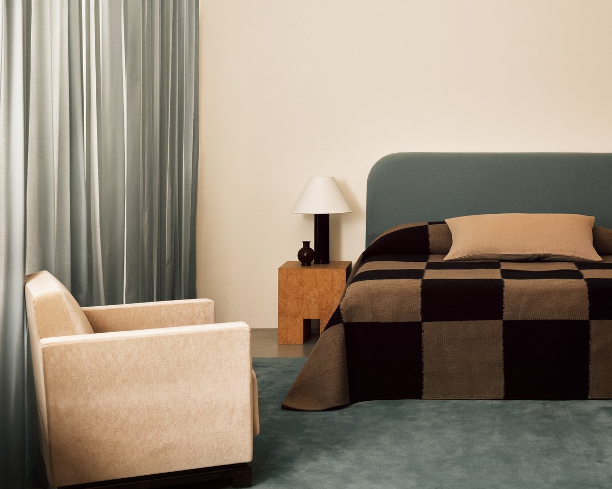
We delve into the world of color with our co-founder and creative director, Liza Berglund Laserow, exploring the inspiration behind our latest Nordic Shade collection.
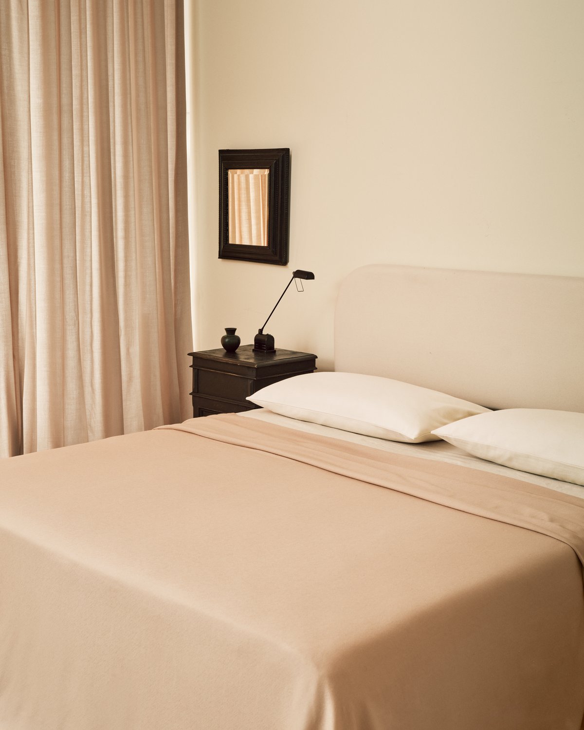
What was your starting point when creating the new Nordic Shade colors?
L: Color is hugely important for the atmosphere and the mood it can create in a home. I’m deeply sensitive to color - the wrong color in a room can be challenging and jarring, but the right color completes a space. When we approached the new Nordic Shade colors we wanted to create a palette which was soothing and calming: ranging from deep, rich, earthy tones to dusty, pale shades.
The new curtain colors are true to the Nordic Knots world of colors. We’ve built a color language through the Grand and Park rug collections, and have become known for these colors. We wanted to expand this world with a complementing collection of curtains, to frame the most harmonious homes.
Whether you’re drawn to the warmth of Leo or the cool serenity of Pale Blue, there’s something here for everyone.
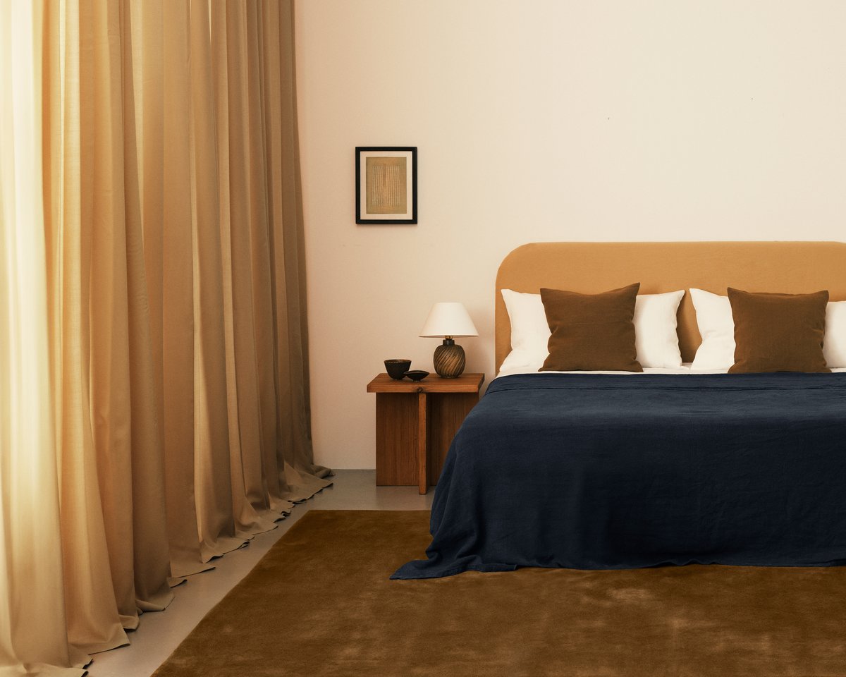
What is the inspiration behind these colors?
L: I believe artificial colors are difficult to incorporate in an interior setting. So we drew inspiration from the colors we know best - found in the surrounding Scandinavian nature and architecture. Along with notable historical design periods in Sweden, with a muted color scheme, like during the Baroque era.
I’m passionate about these natural tones – from the reds found in old charming Swedish countryside houses to the pale greens and faded blues in the archipelago. These colors are the most grounding and inviting to use in a home.
How do you approach color in a home?
L: It really depends on the room. When approaching color for a smaller space, I like to be bolder. You can have such fun mixing different colors in a small room to create an impact. When looking at color for a larger space, I like to choose unified shades - creating a calm backdrop, so that it is soft and easy on the eye and easily goes with other textures and furnishings in the room.
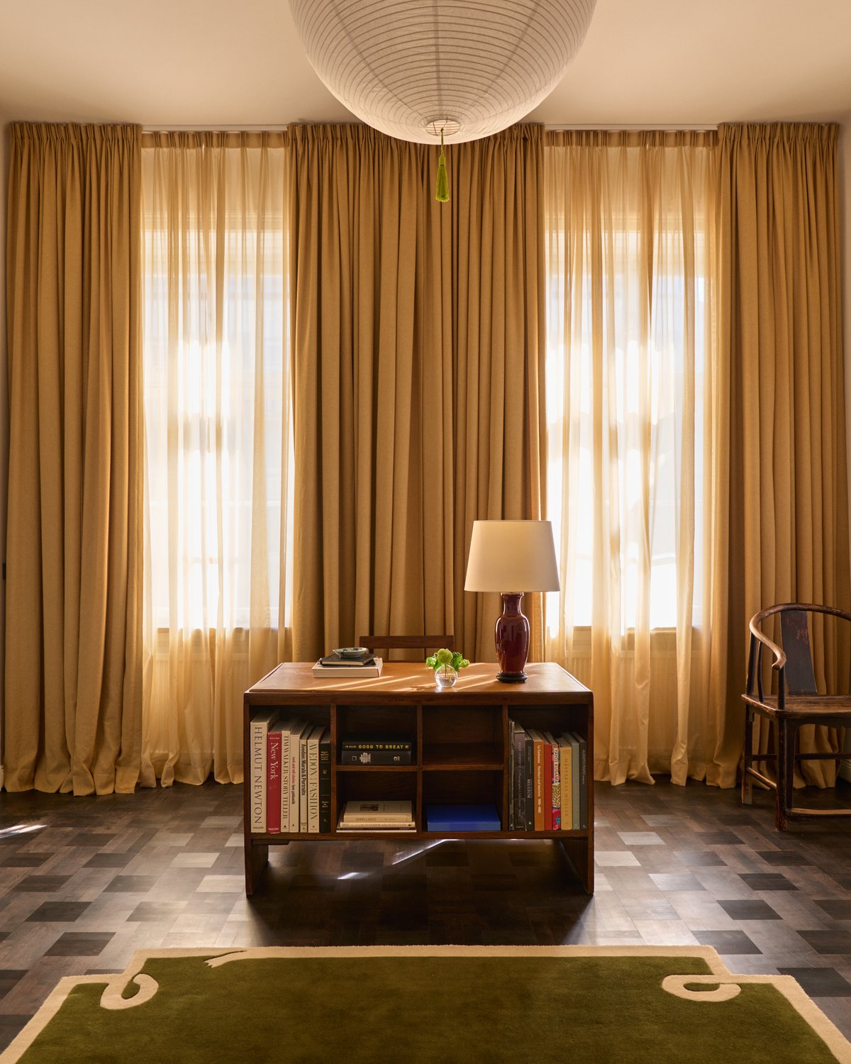
Pairing Nordic Shade in Leo with Loops Green rug designed by Giancarlo Vallé in Liza’s home.
How would you style the Nordic Shade colors and what are your favorite pairings?
The beauty of the Nordic Shade colors is that there are endless ways to use and style them to dress your home. A thread of timeless neutrality runs throughout each color, so they are as versatile as they are beautiful. Easily dressed on their own, use the shades individually in your space to create a clean and uniform backdrop or mix the colors as much as you like. They all go seamlessly together!
We’ve crafted these colors to encourage customers to have fun with color and explore the various combinations. There is a whole world of colors to mix and match.
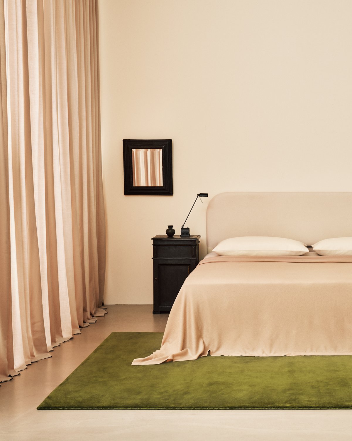
”If you're decorating a smaller space, I love the Old Rose curtains paired with the Grand Milano Green rug. It is unexpected yet intriguing and completely captivating.”
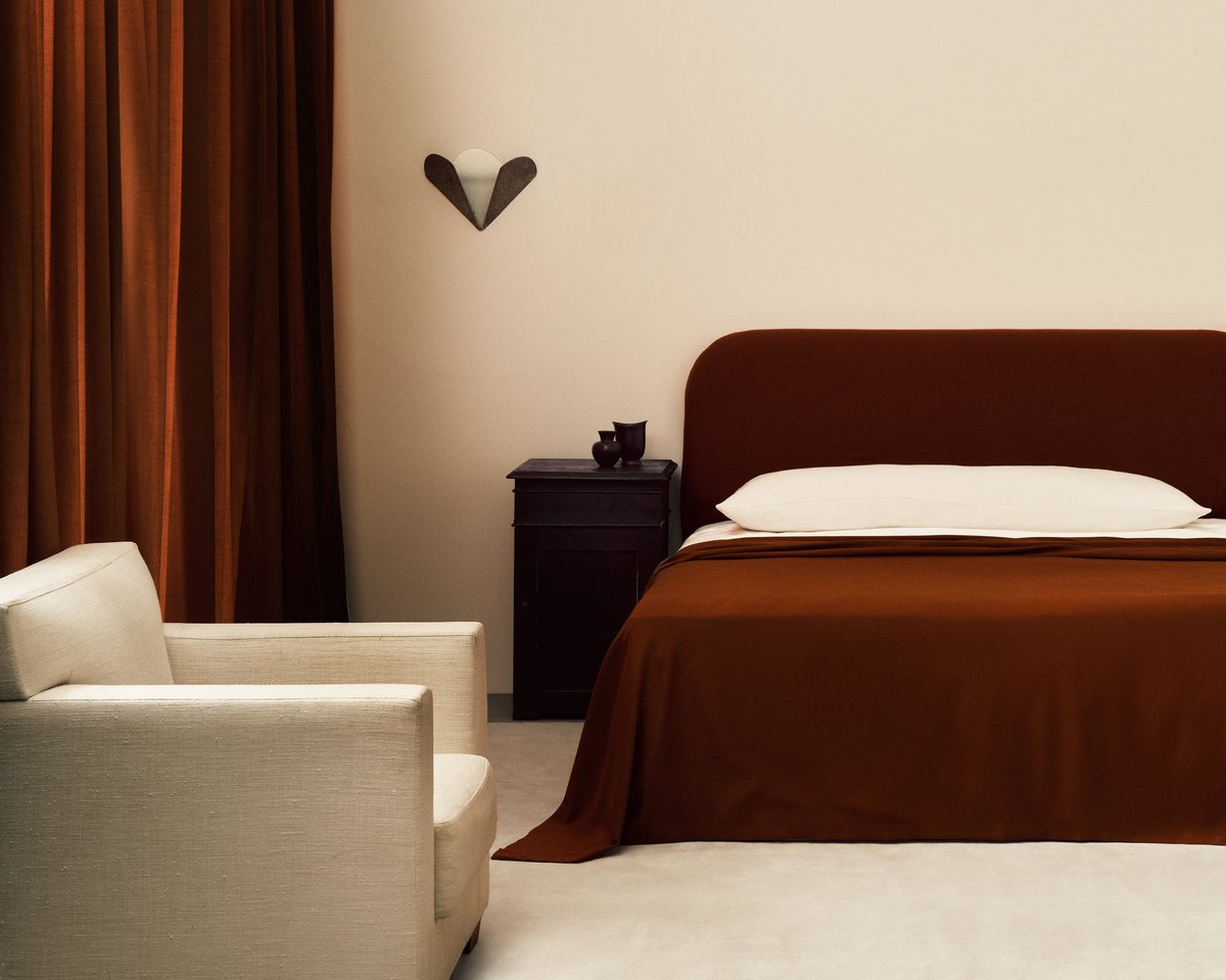
”If you’re looking to create a little more drama in a room I would look at the Burnt Red curtains paired with the Grand Dusty White rug – it’s stunning.”
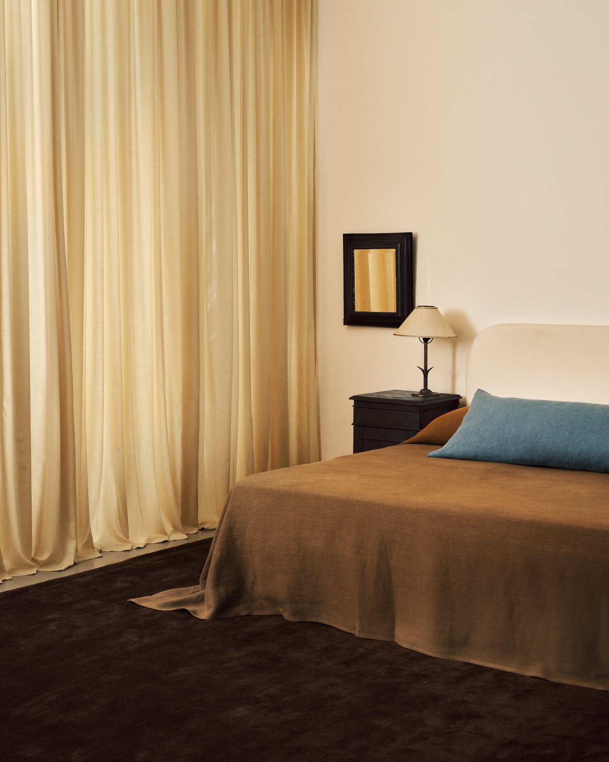
”A classic combination has to be the Sunrise curtains paired with Grand Walnut rug – an ultimate favorite of mine.”