THE FW26 SIGNATURE LOOKS
A well-made bed is one thing. A well-dressed one is another.
Crisp cotton, generous layers and rich texture set the tone for Fall/Winter 26. Colour is used confidently, contrast deliberately. Comfort, with character.


LOOK 1: DÉJA VU
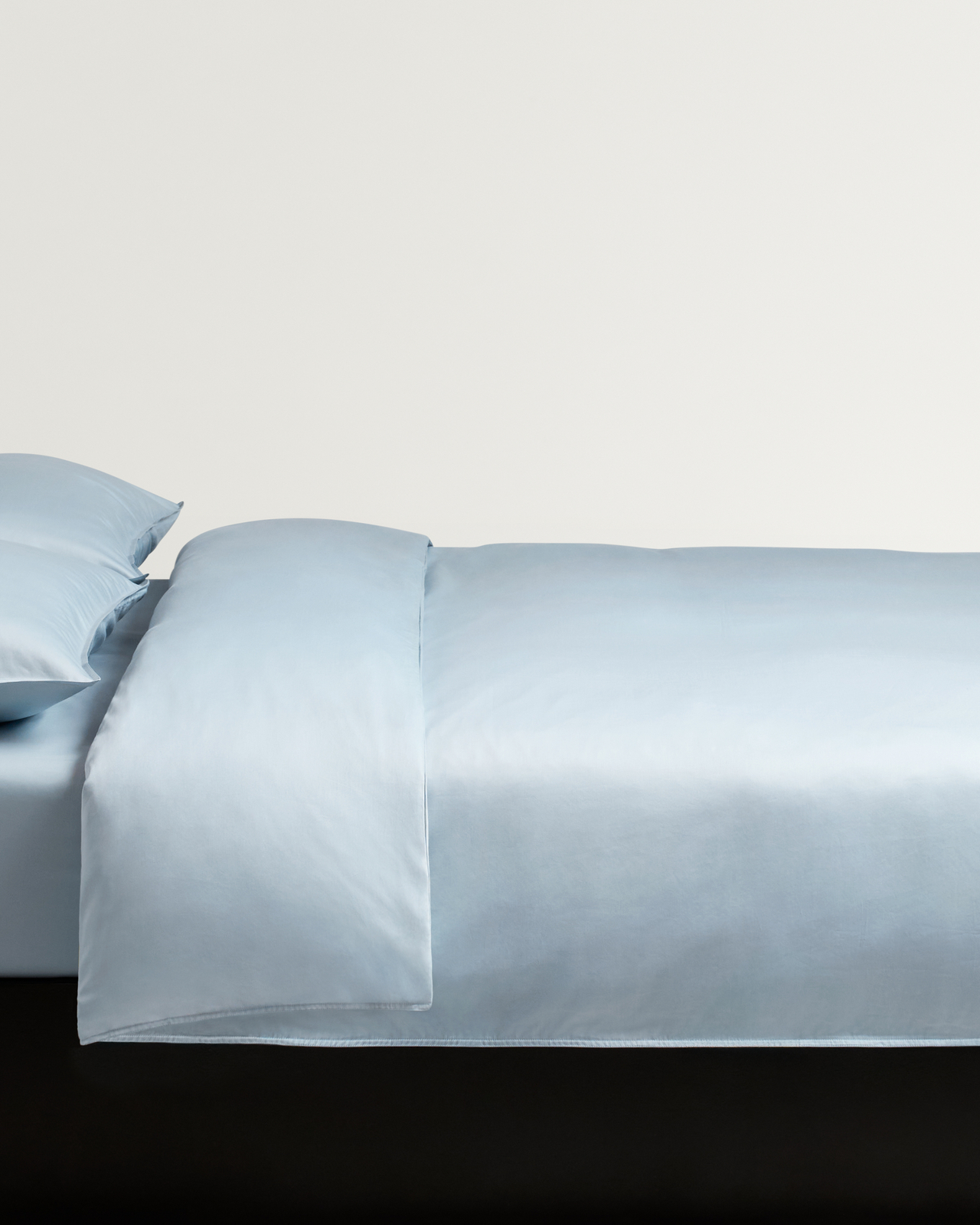
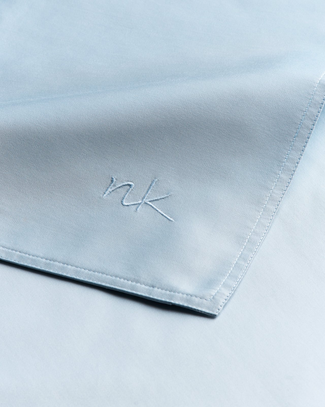
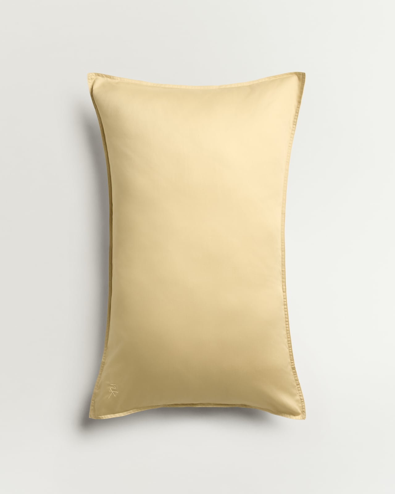
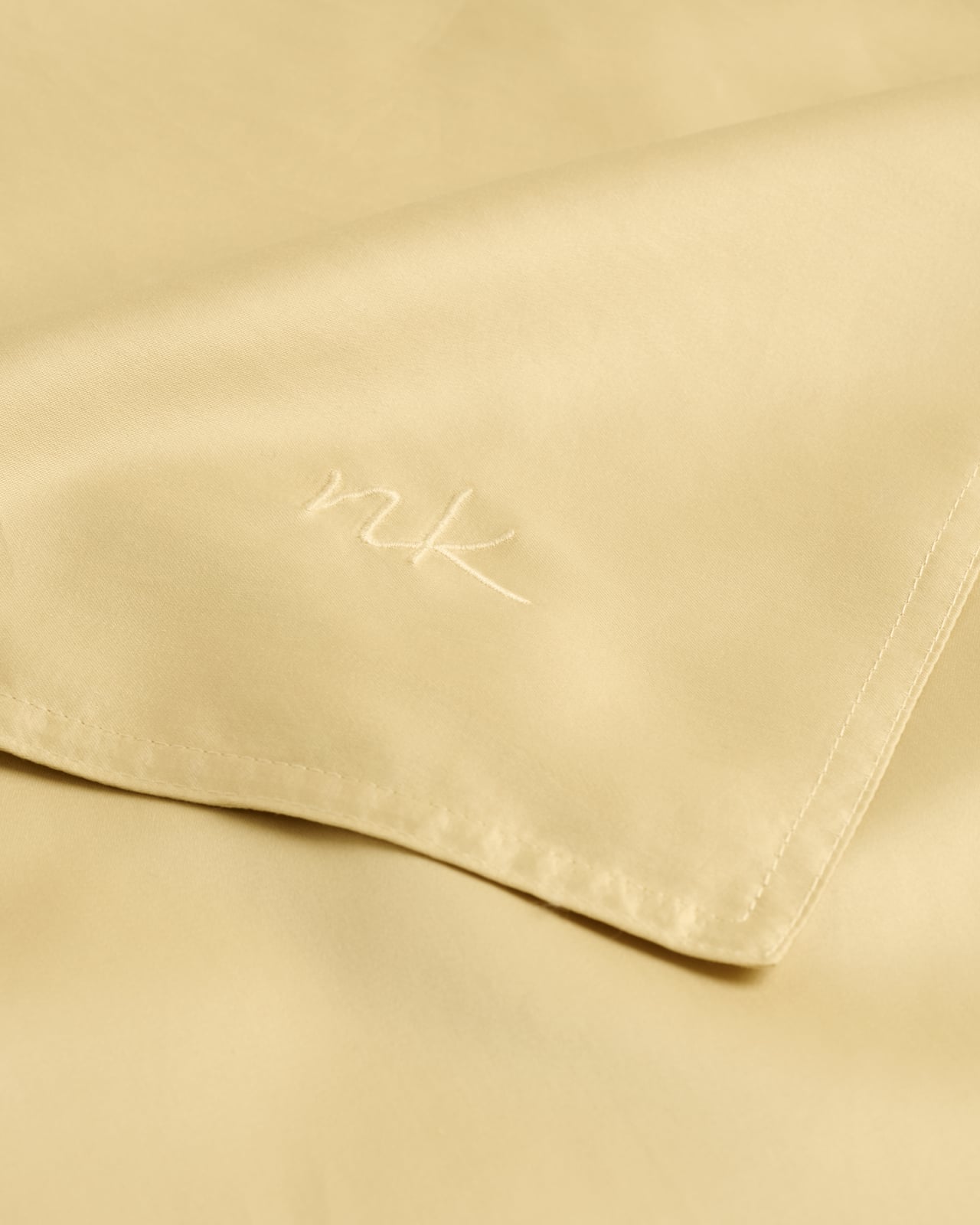
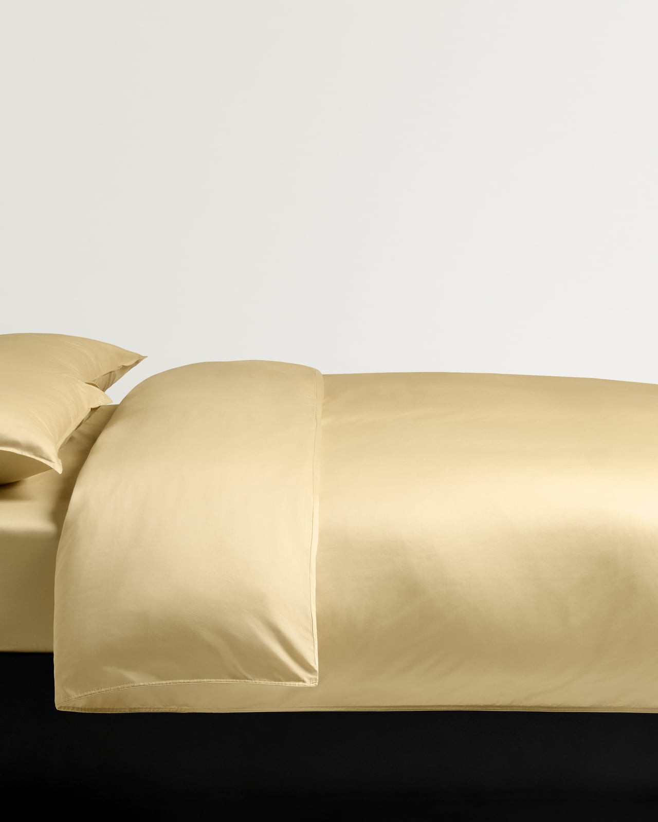
A familiar feeling. Sunrise Sateen brings a soft glow to pale blue, as well as a cloudlike sensation to the skin. Retro browns and touches of lavender – a palette with something distinctly nostalgic about it.
New in
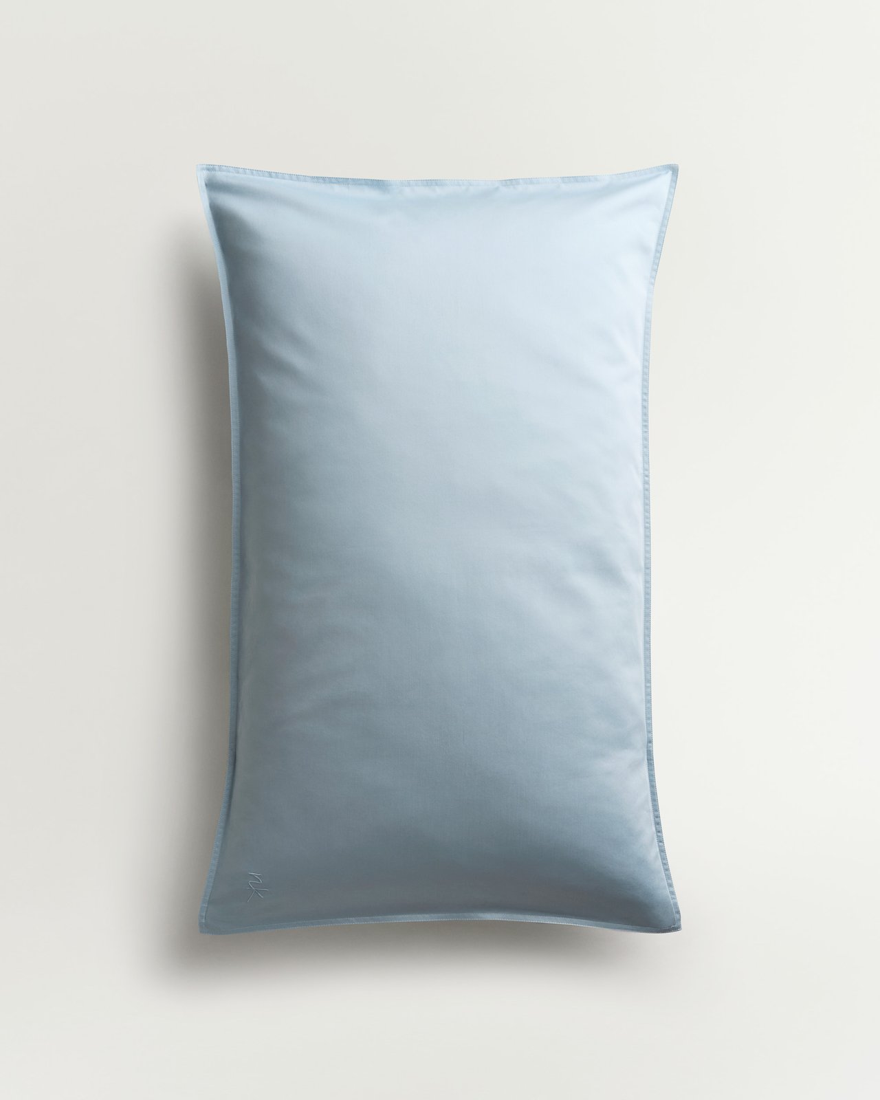
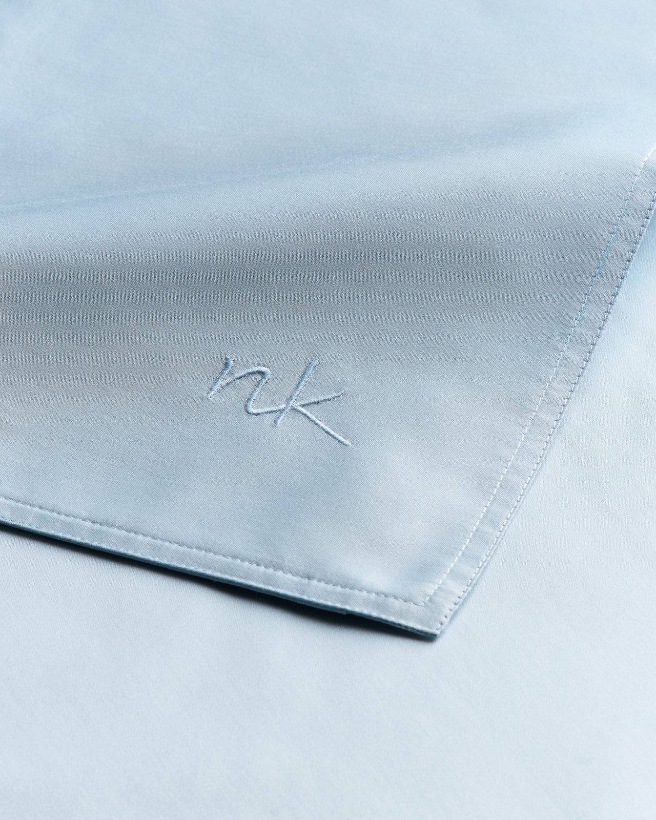
Sateen Pillow Case (Set of 2) – Sunrise
Luxury Cotton Sateen
From £75
New in
Sateen Duvet Cover – Sunrise
Luxury Cotton Sateen
From £190
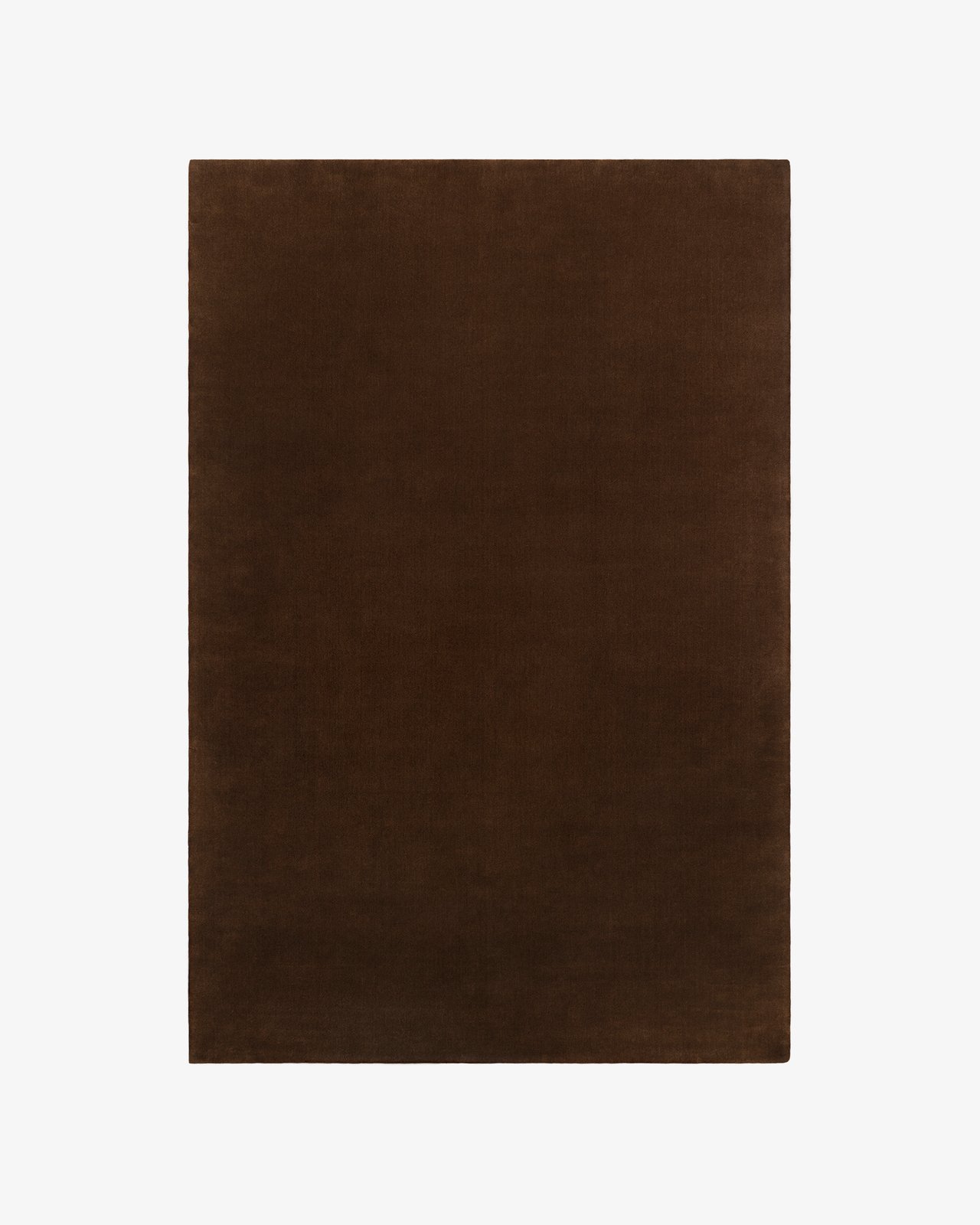
Grand – Walnut
Plush Luxury Wool Rug
From £595
New in
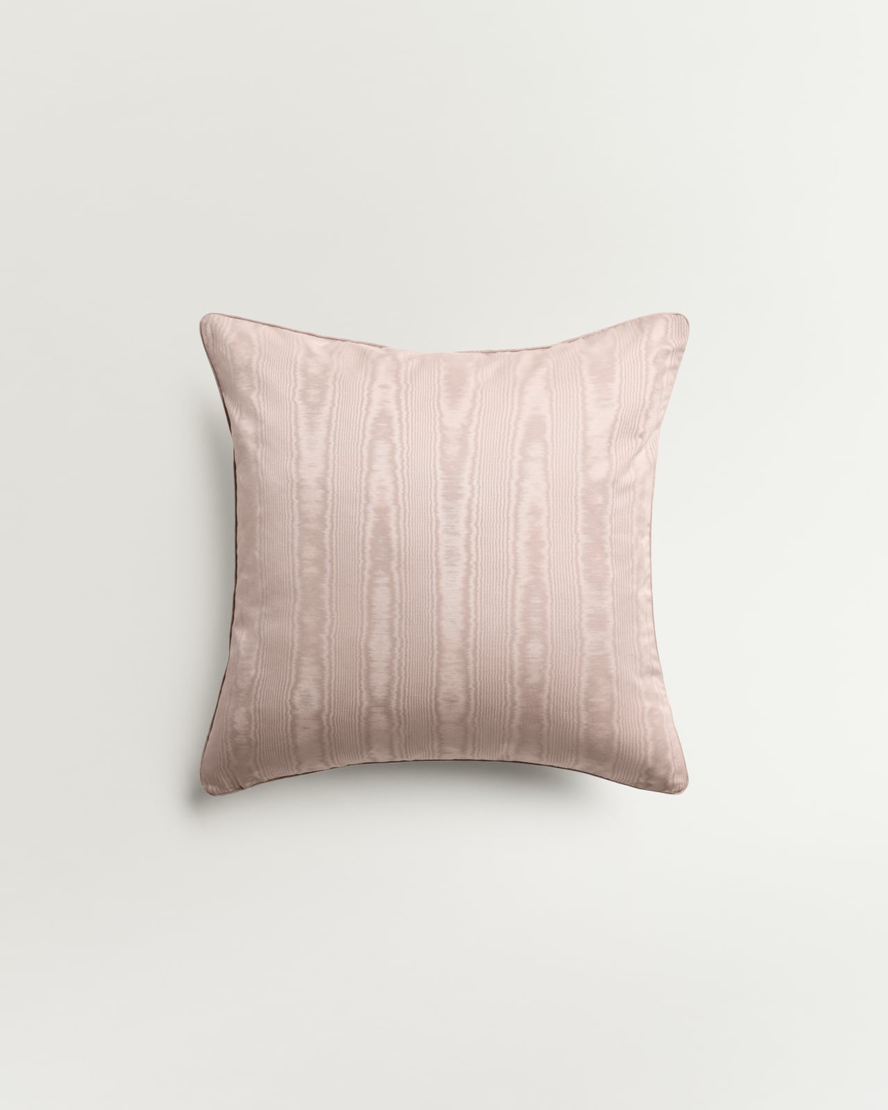
Moiré – Lavender
Patterned Cushion Cover
£145
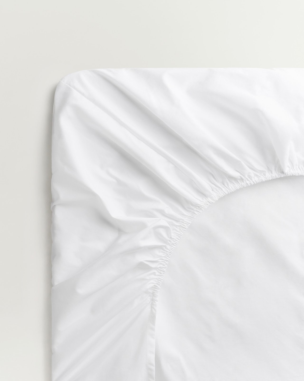
Sateen Fitted Sheet – Crisp White
Luxury Cotton Sateen
From £110
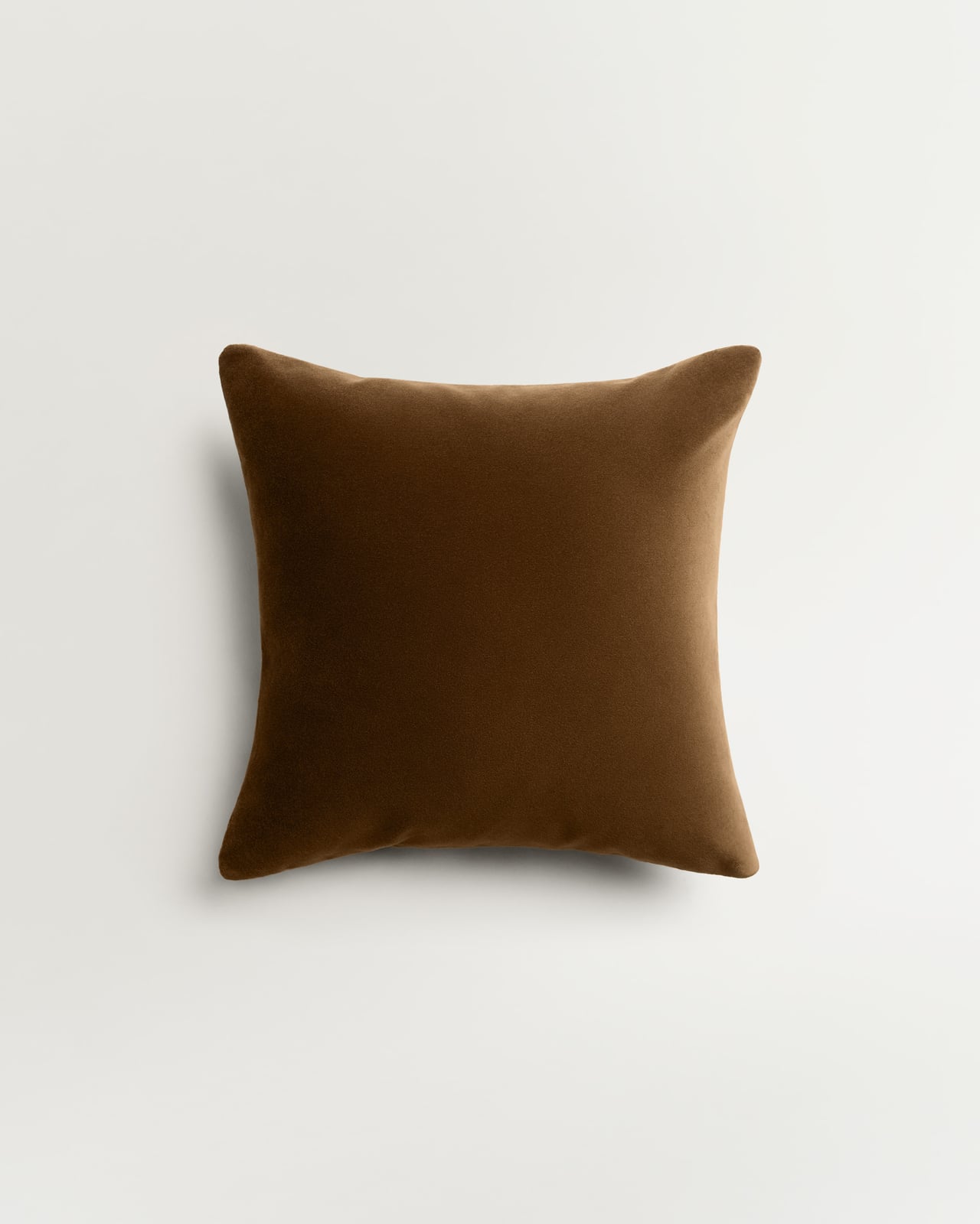
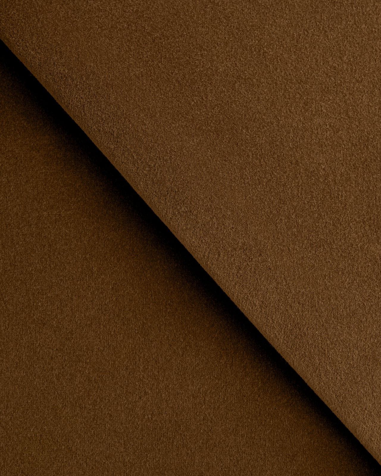
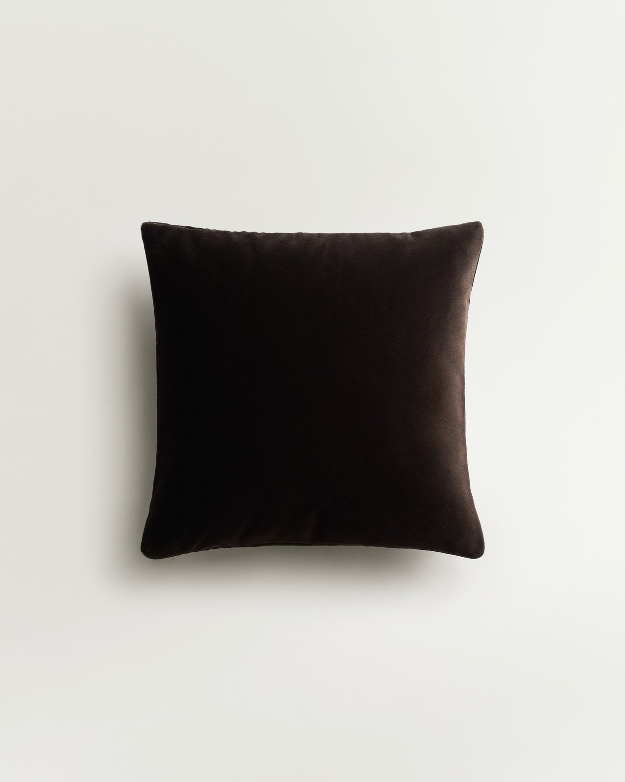
Teddy Velvet – Walnut
Plush Velvet Cushion Cover
£115
New in
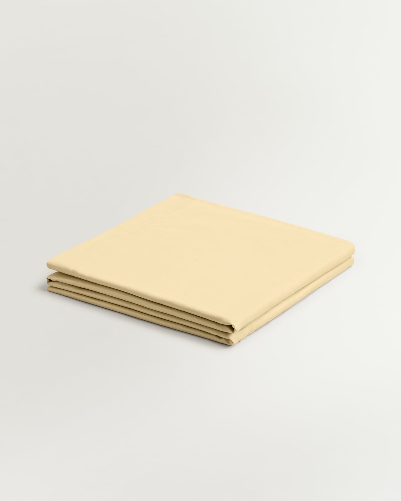
Sateen Flat Sheet – Sunrise
Luxury Cotton Sateen
From £110



LOOK 2: NOCTURNE
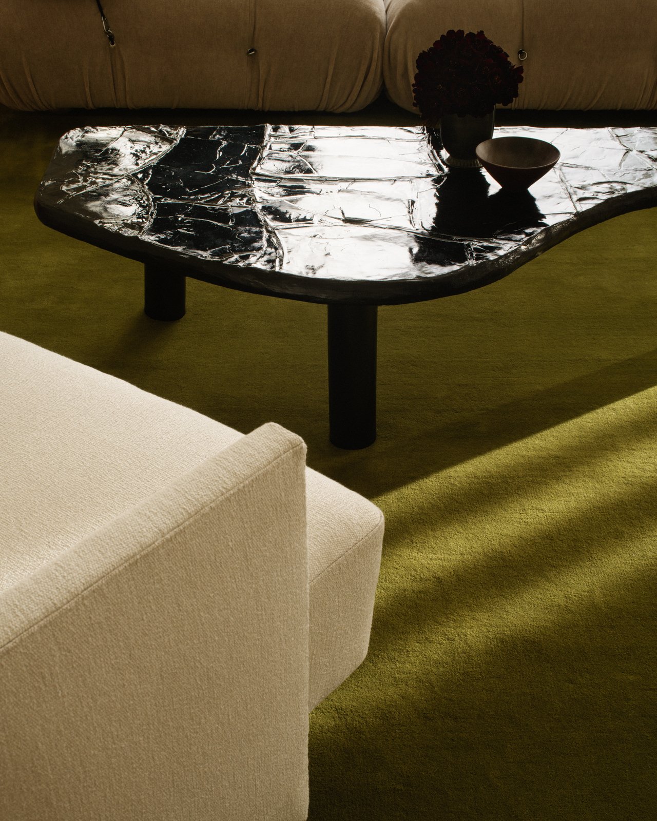
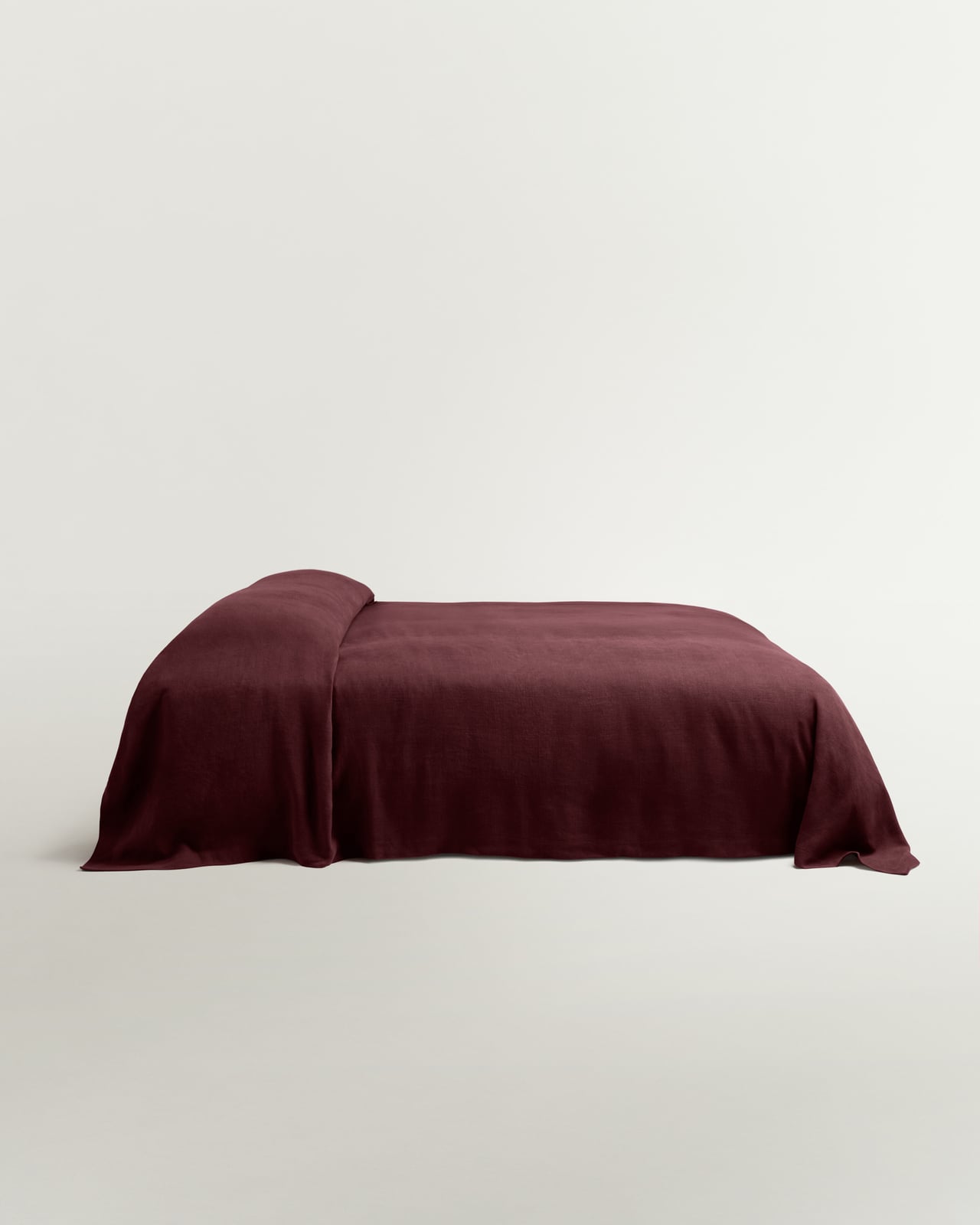
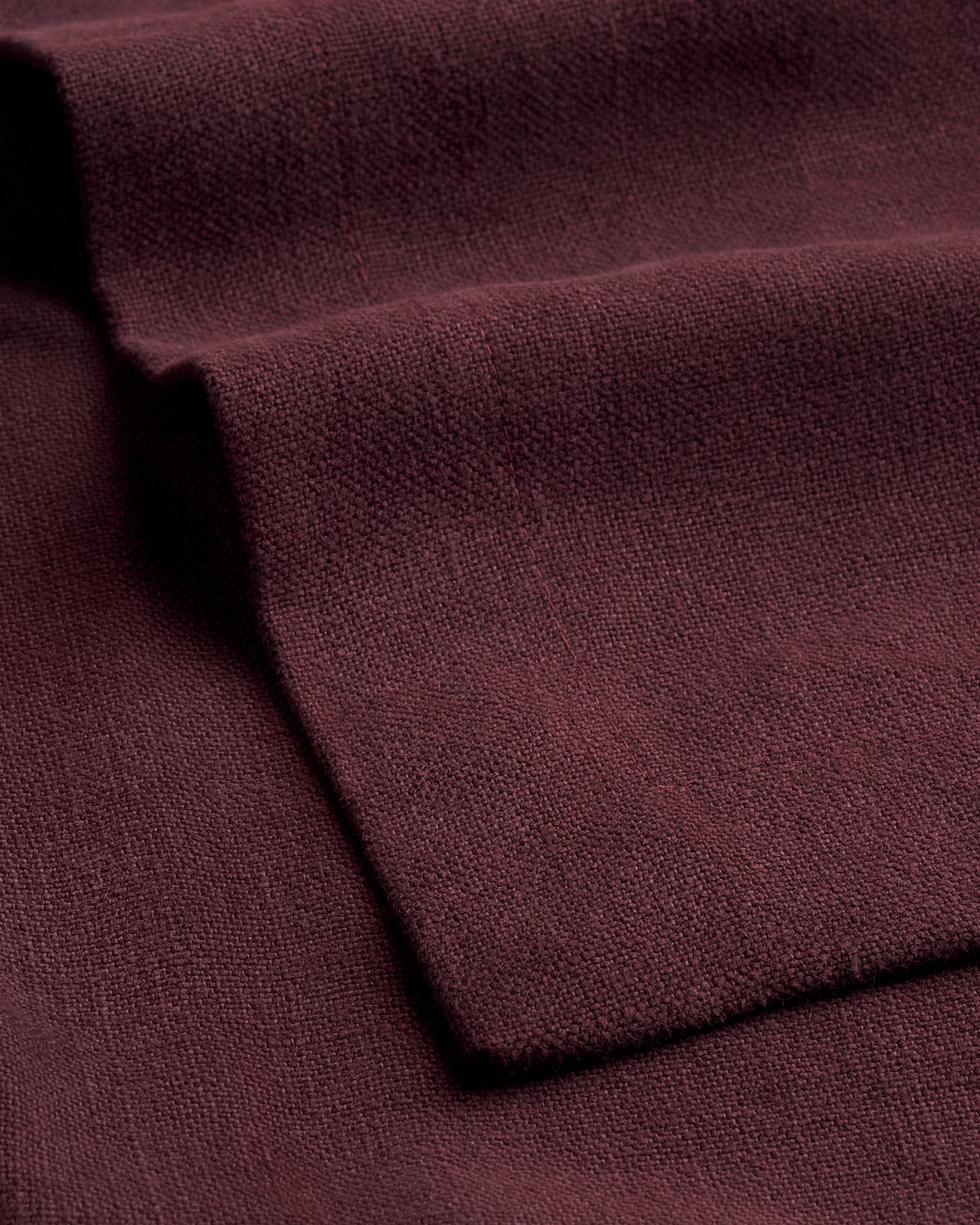
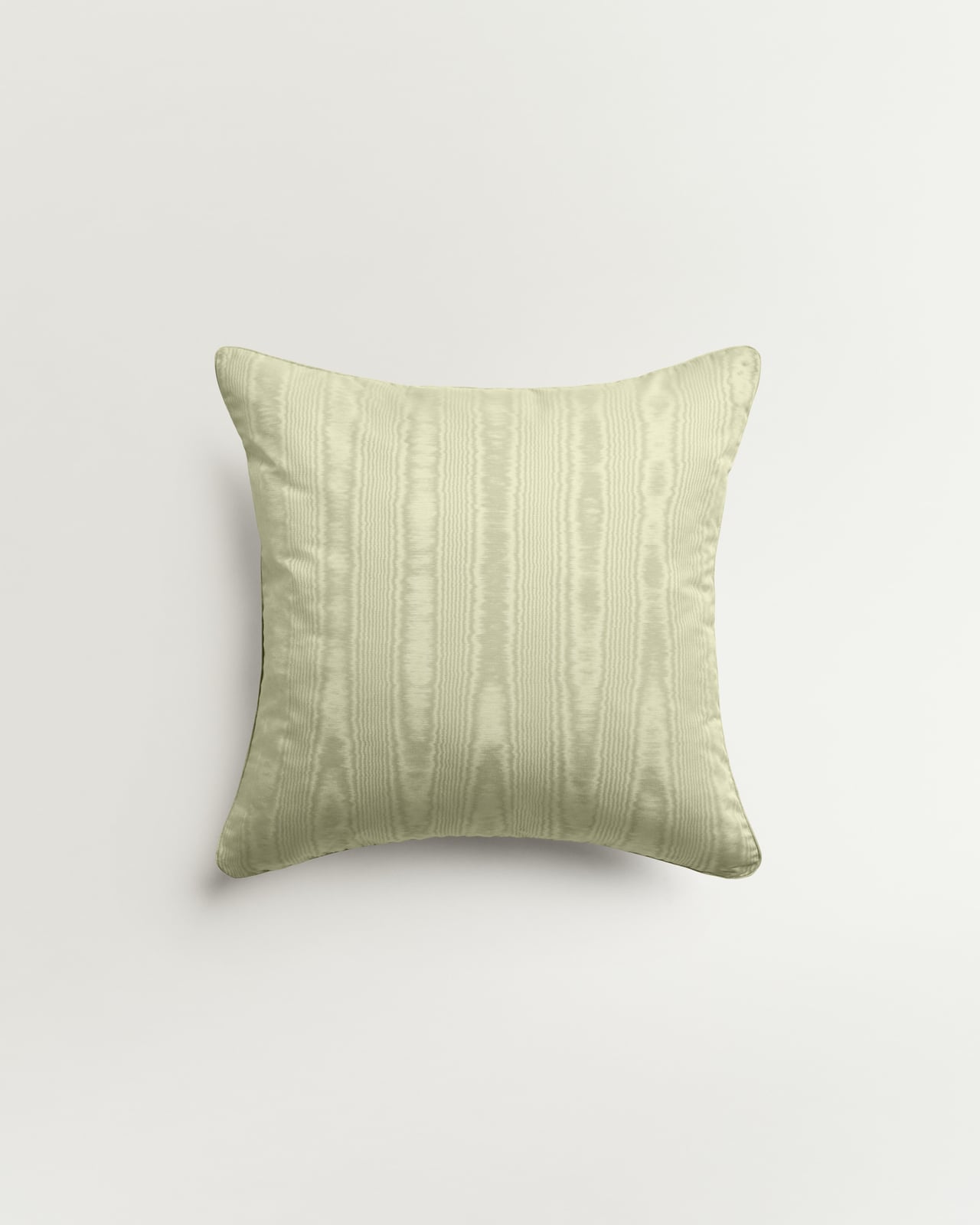
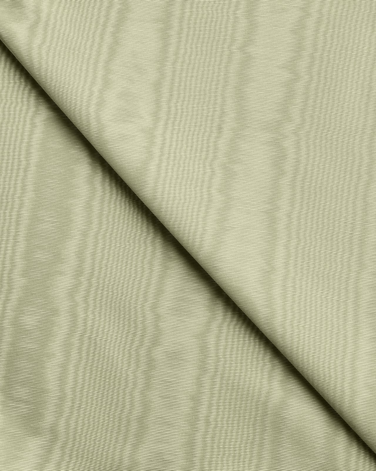
Deep Wine, Pistachio and Milano Green sit somewhere between earthy and extravagant. Linen, moiré and wool give each shade its own character – combining contrasting qualities of airiness, plush texture and iridescent shifts.
New in
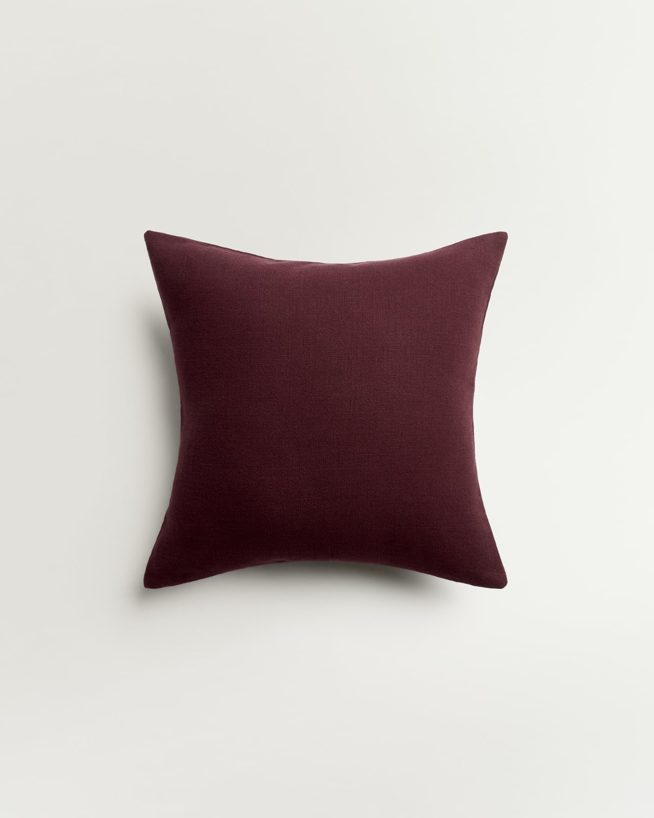
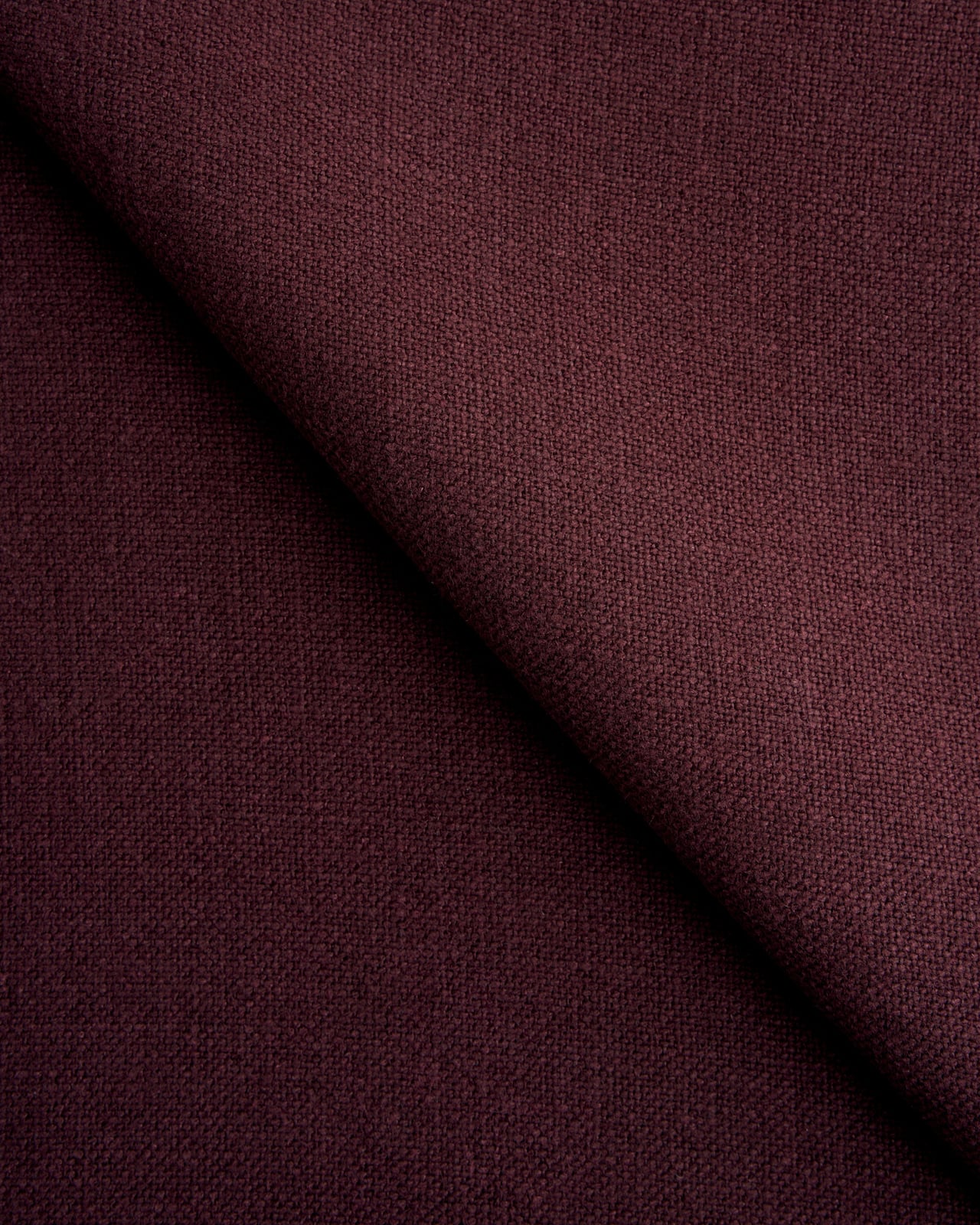
Studio Linen – Deep Wine
100% Linen Cushion Cover
£85
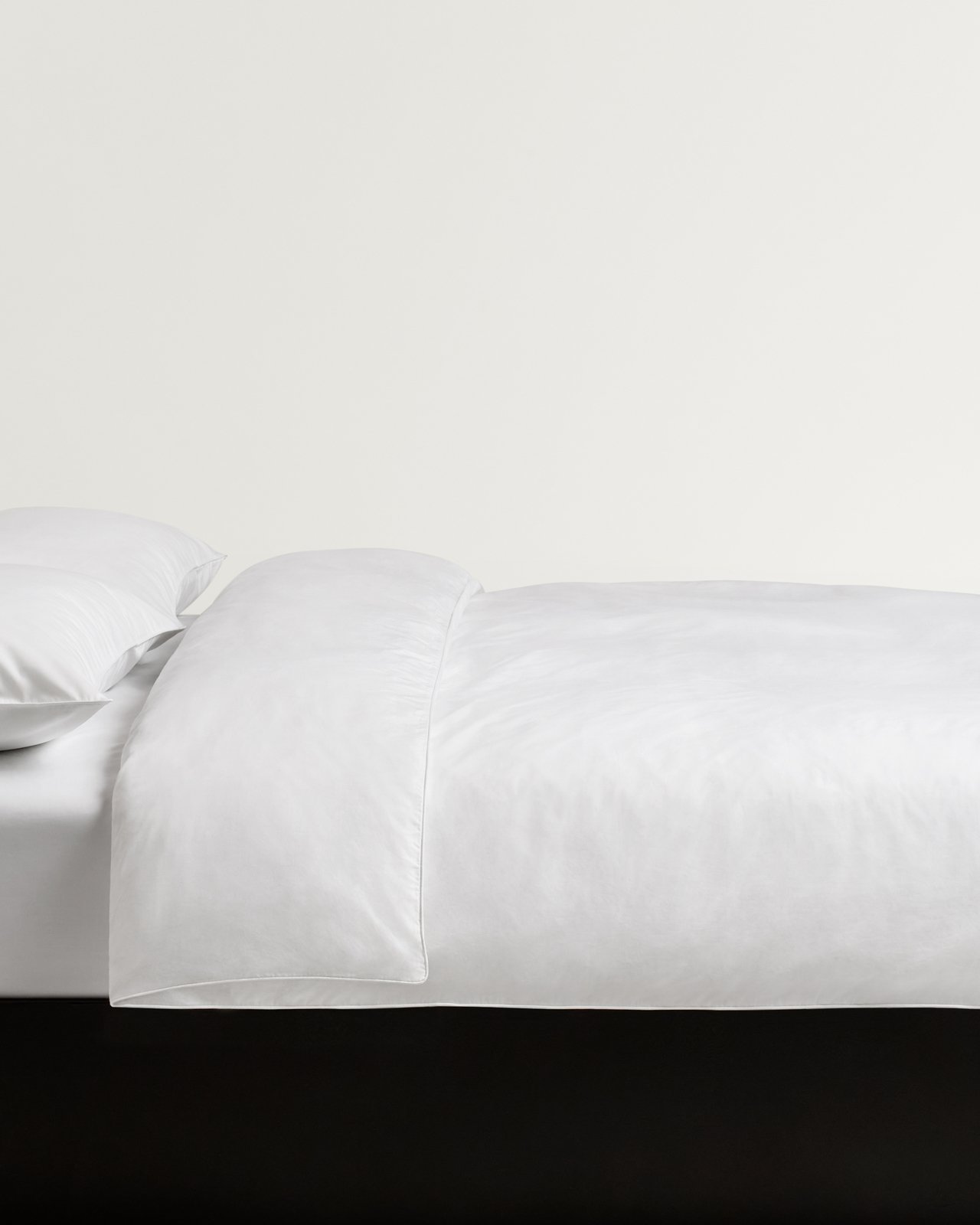
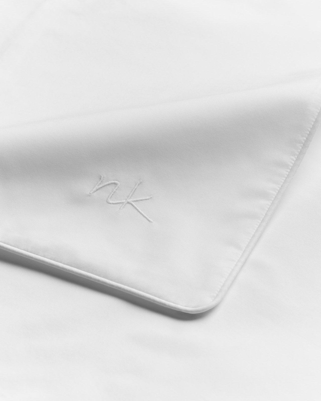
Percale Duvet Cover – Crisp White/White
Lightweight Cotton Percale
From £160
Grand – Milano Green
Plush Luxury Wool Rug
From £595
New in
Studio Linen – Deep Wine
Midweight Linen Bedspread
£335
New in
Moiré – Pistachio
Patterned Cushion Cover
£145
Percale Pillow Case (Set of 2) – Crisp White/White
Lightweight Cotton Percale
From £65



LOOK 3: DARK & STORMY
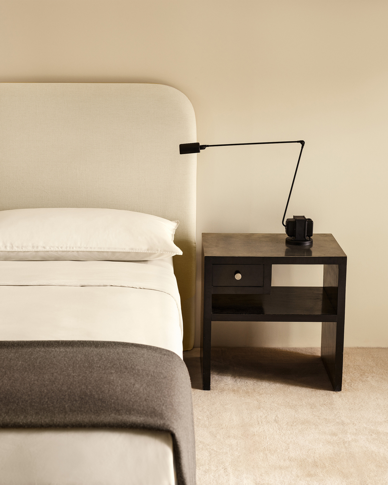
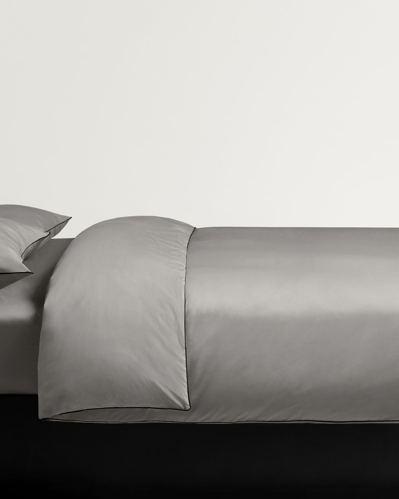
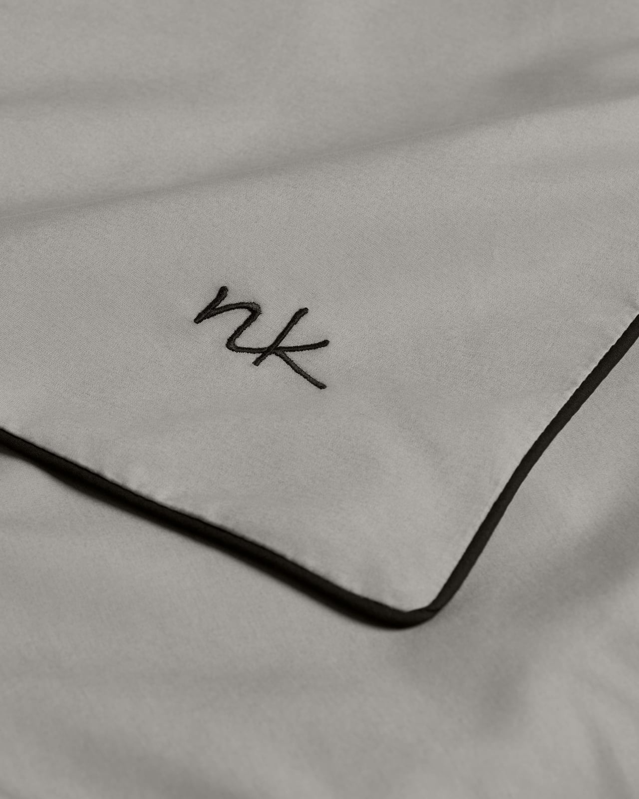
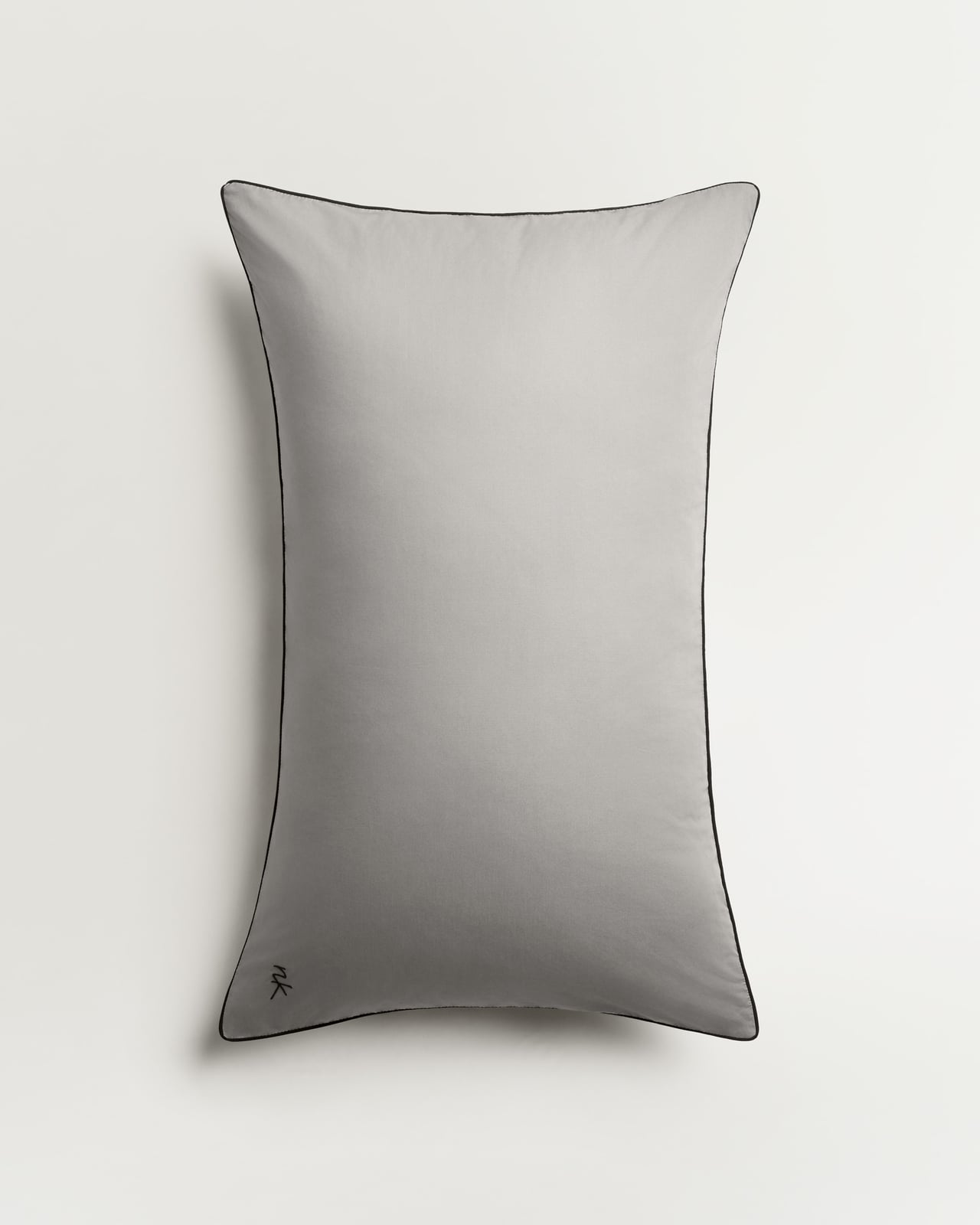
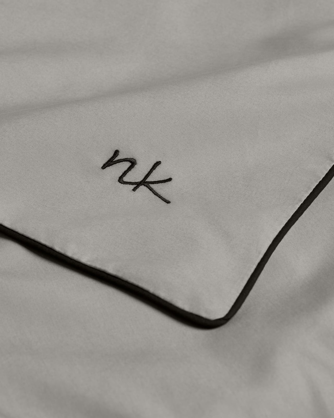
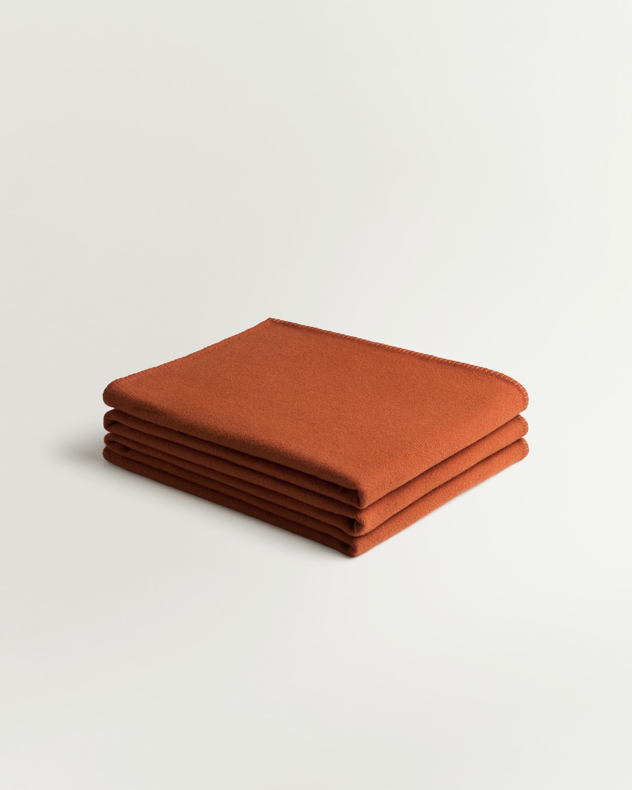
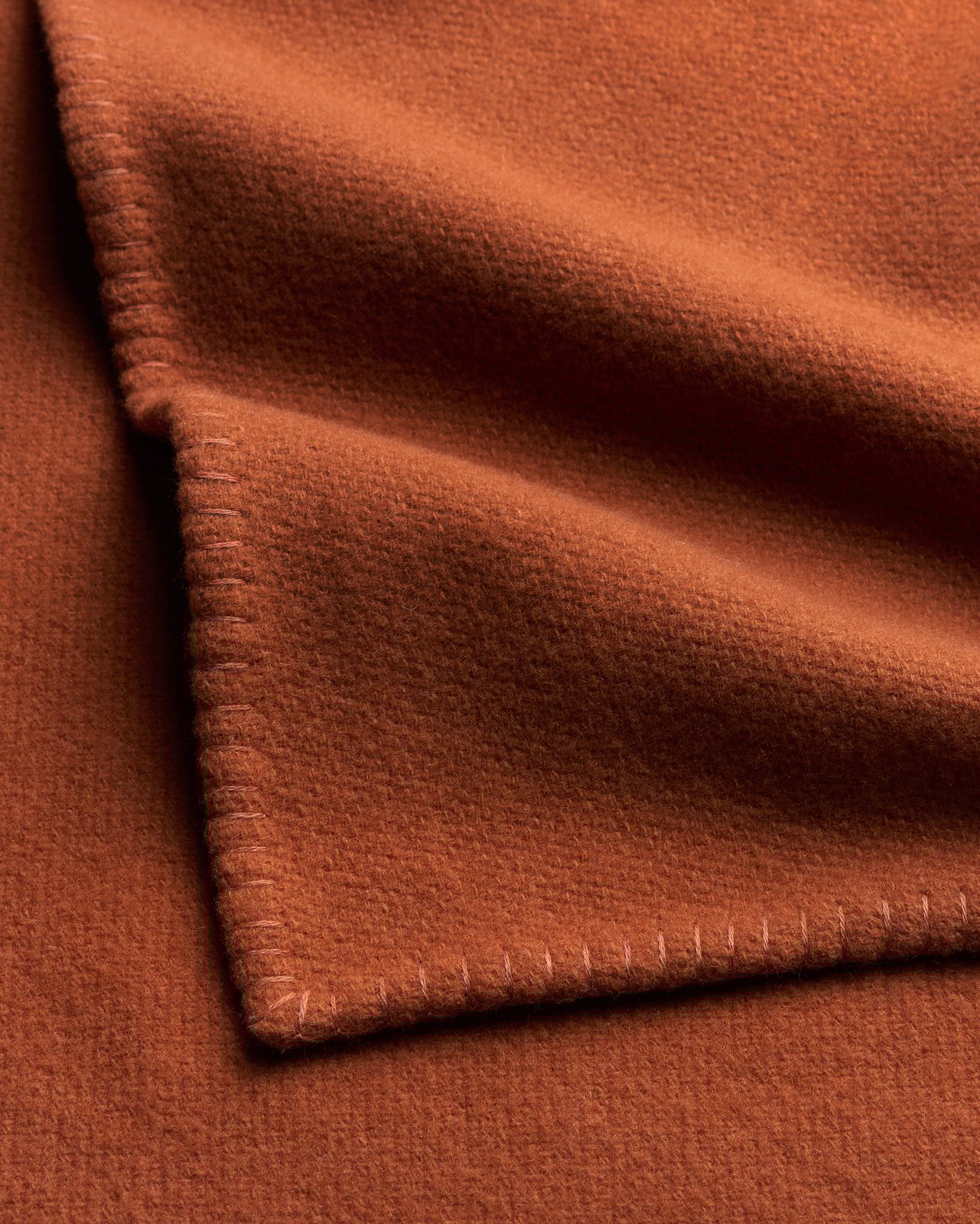
Cool charcoal Percale, traced with black piping, punctuated by burnt red cashmere. Animal underfoot adds pattern to an already unlikely mix, creating an elegant blend of crispness, rich density and an indulgent softness.
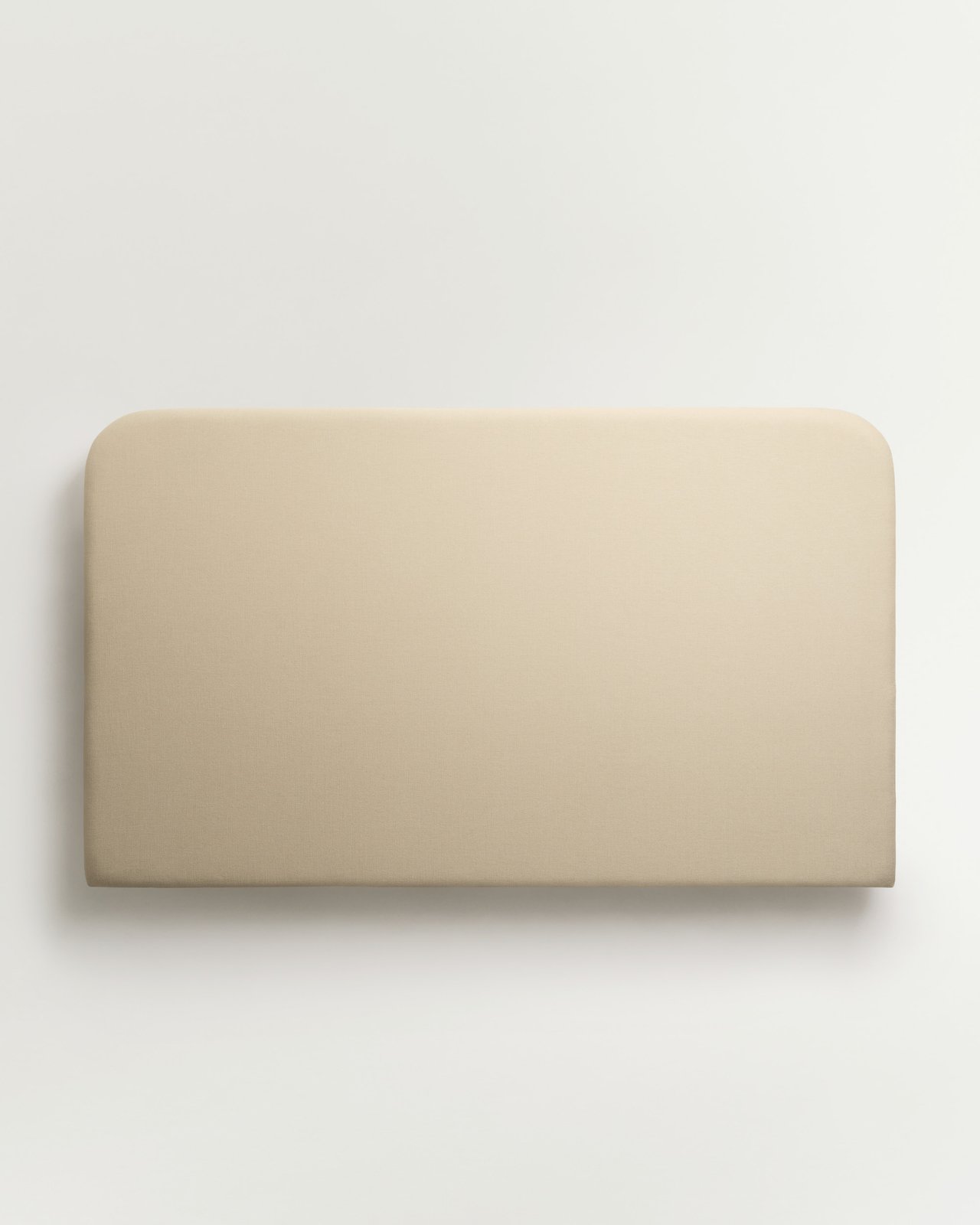
Signature – Sand
Cotton-Linen Upholstered Headboard
From £1 000
New in
Percale Duvet Cover – Gray/Black
Lightweight Cotton Percale
From £160
New in
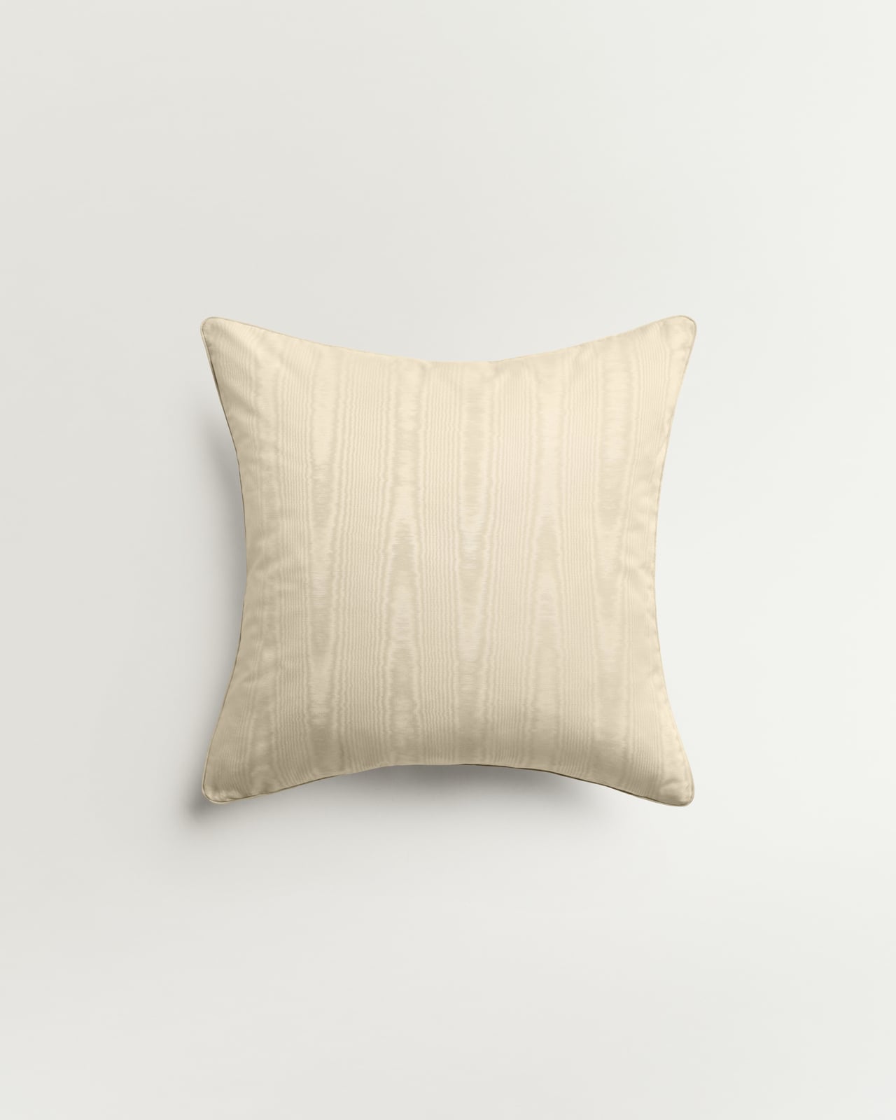
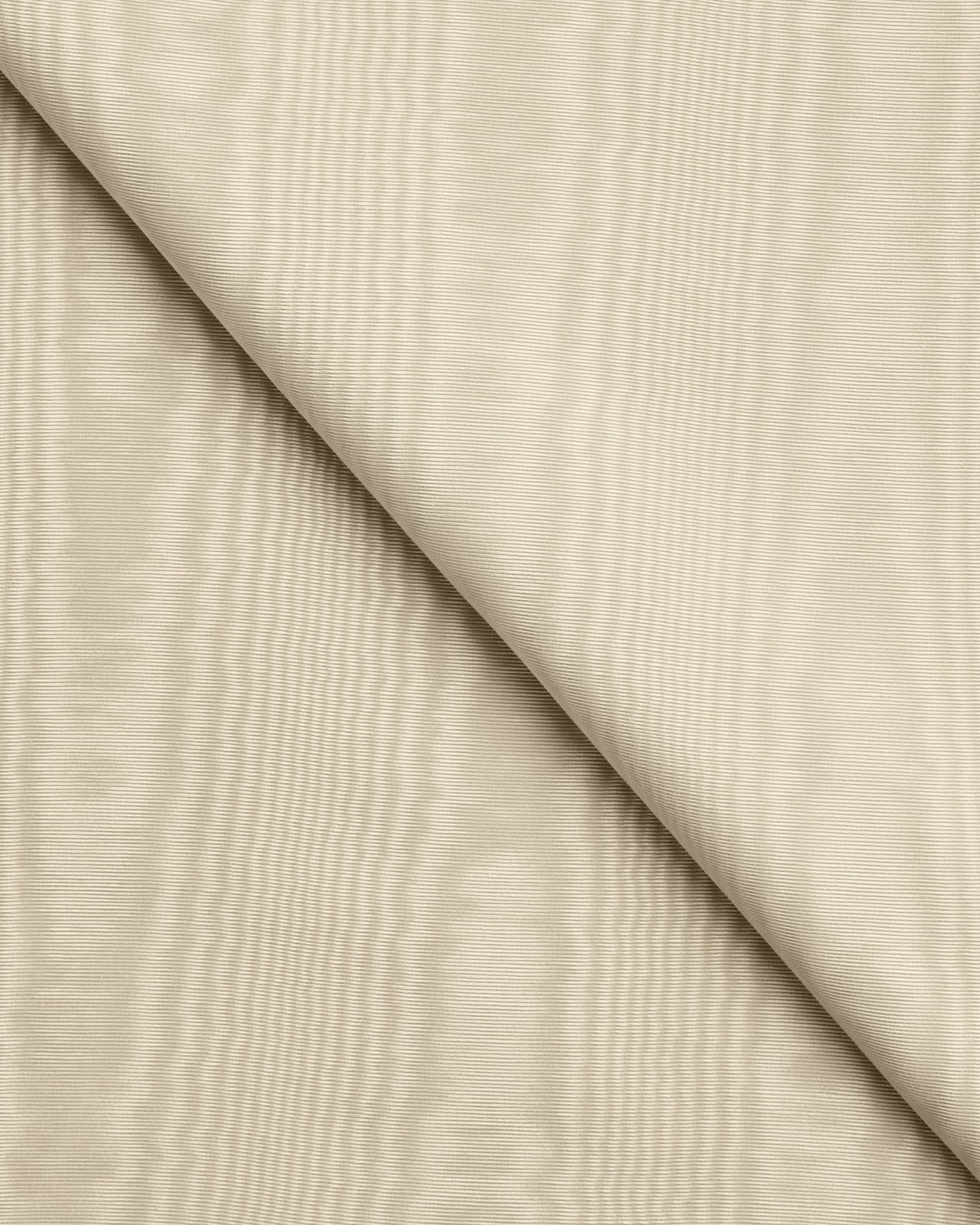
Moiré – Sand
Patterned Cushion Cover
£145
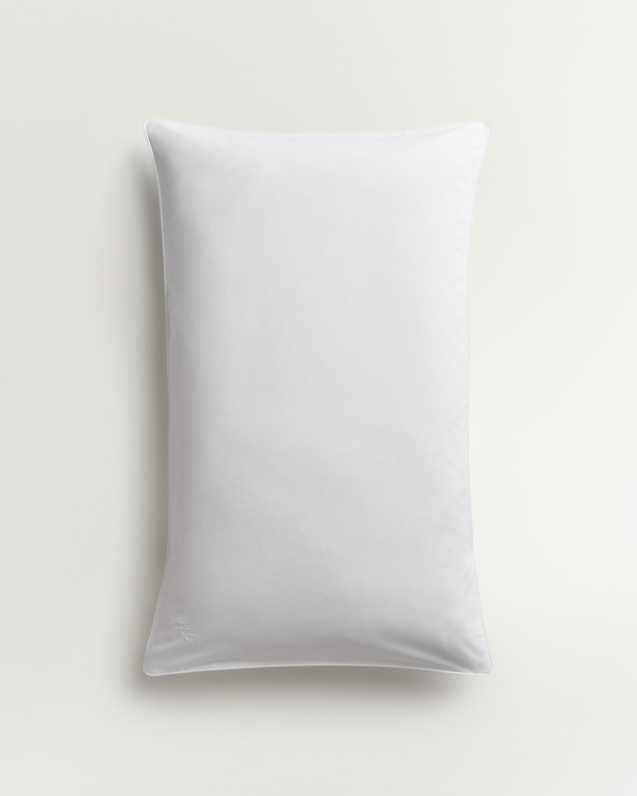
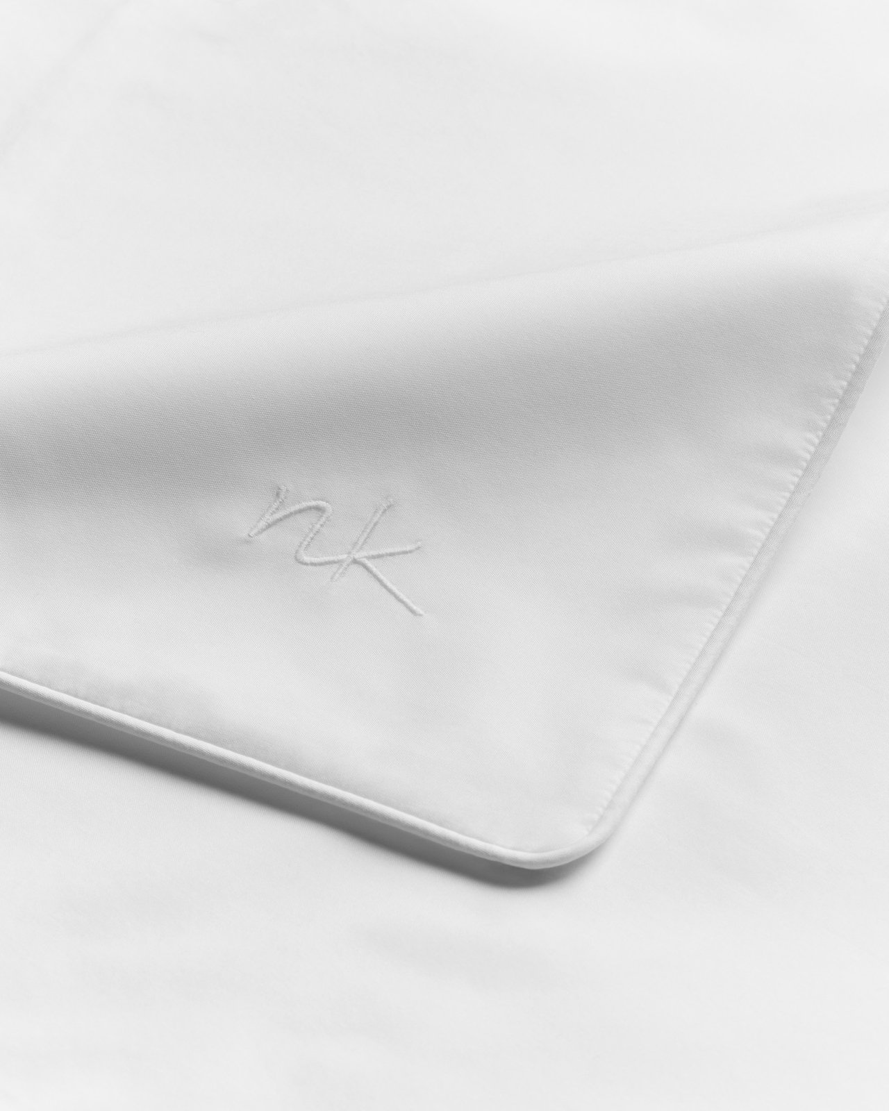
New in
Percale Pillow Case (Set of 2) – Gray/Black
Lightweight Cotton Percale
From £65
Heritage – Rust
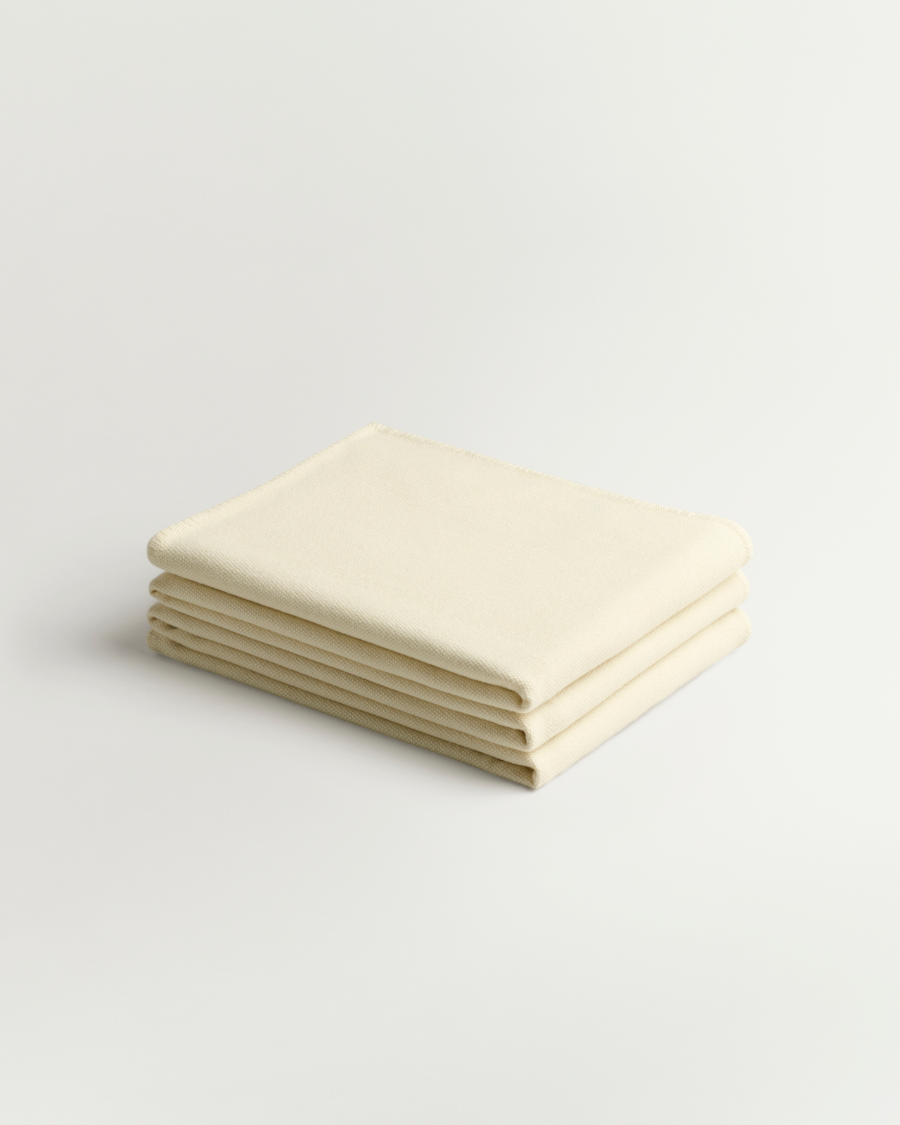
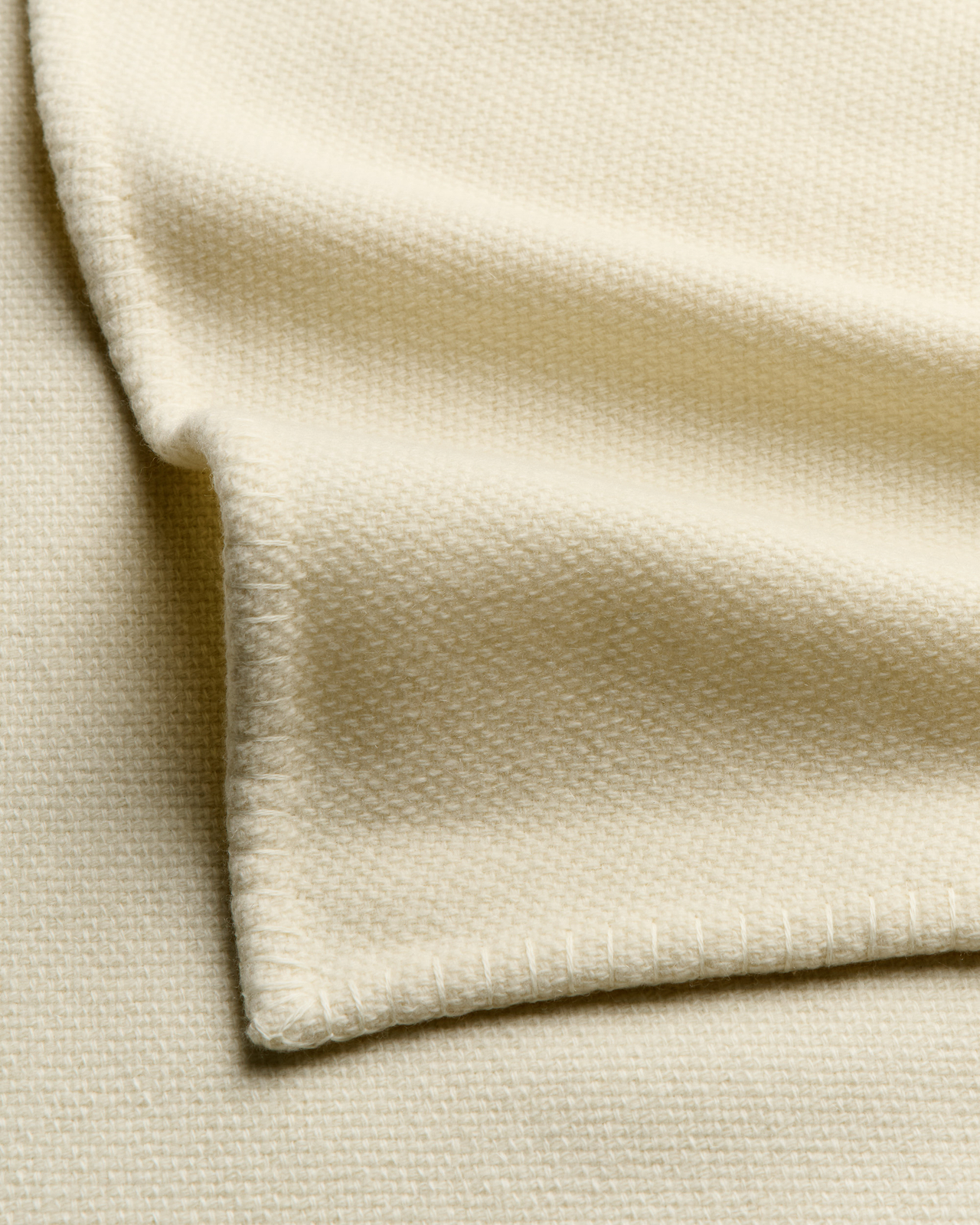
Cashmere Throw
£515
New in
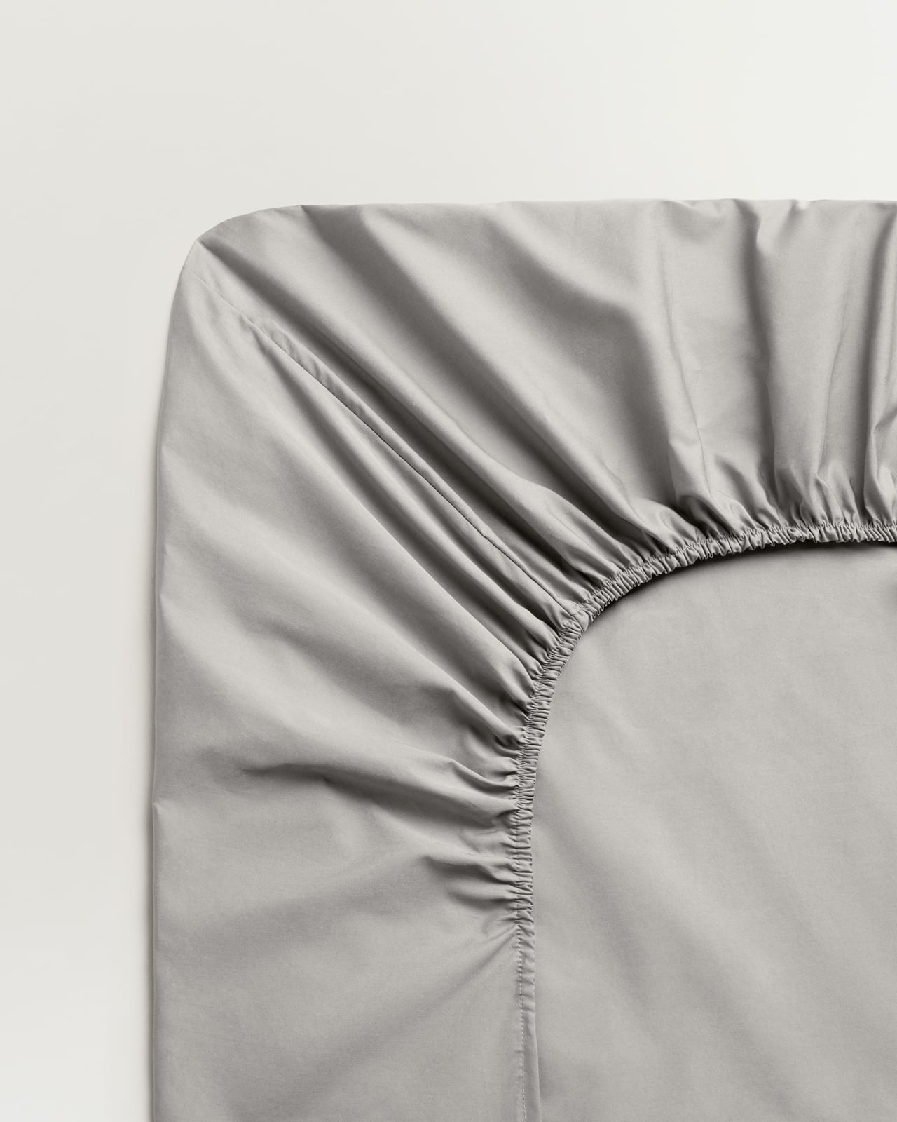
Percale Fitted Sheet – Gray/Black
Lightweight Cotton Percale
From £95
New in
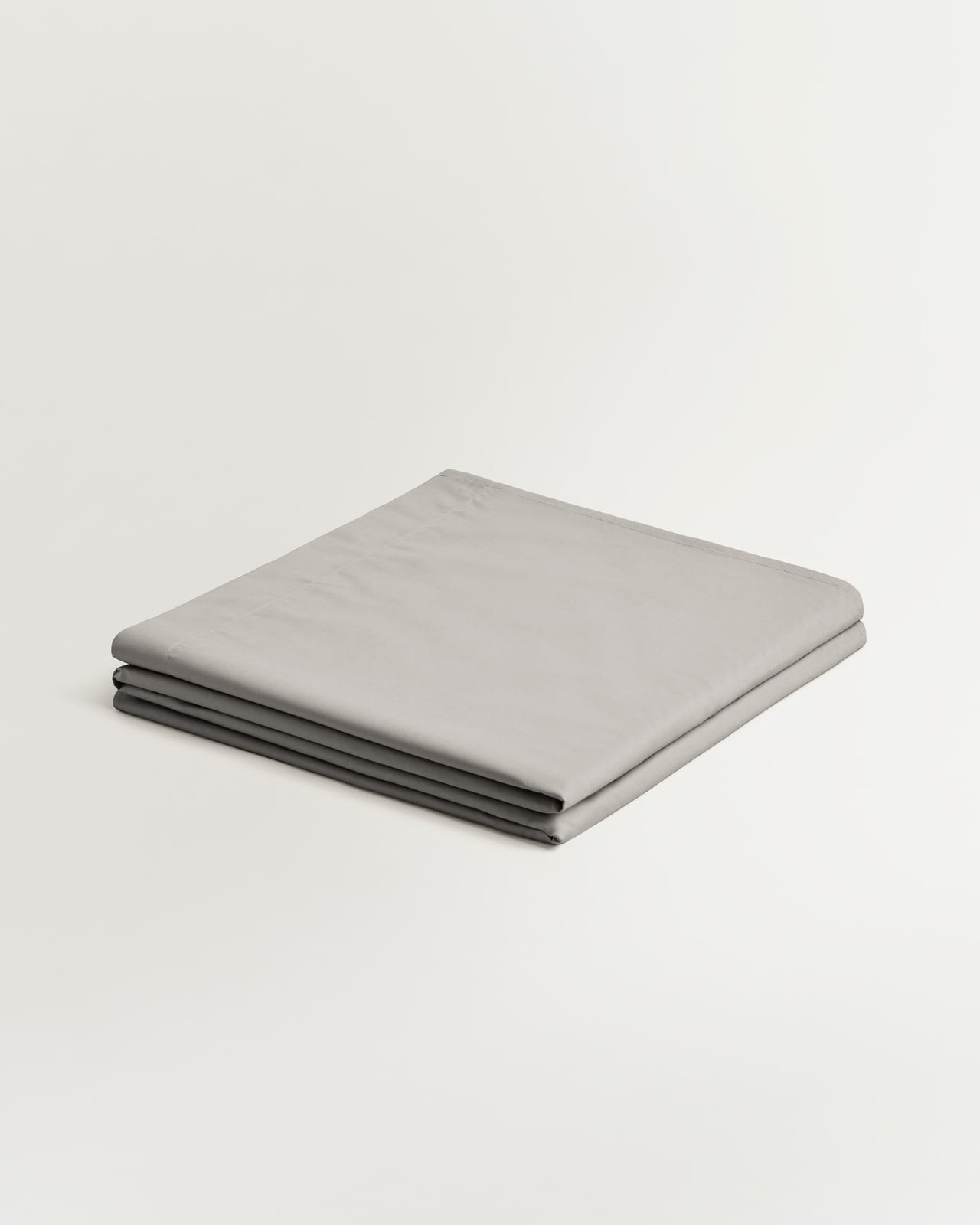
Percale Flat Sheet – Gray/Black
Lightweight Cotton Percale
From £95


LOOK 4: BLUSH HOUR
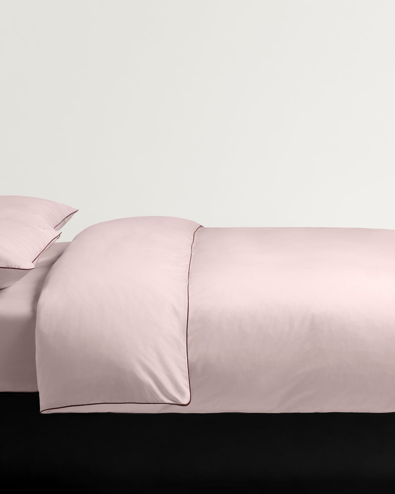
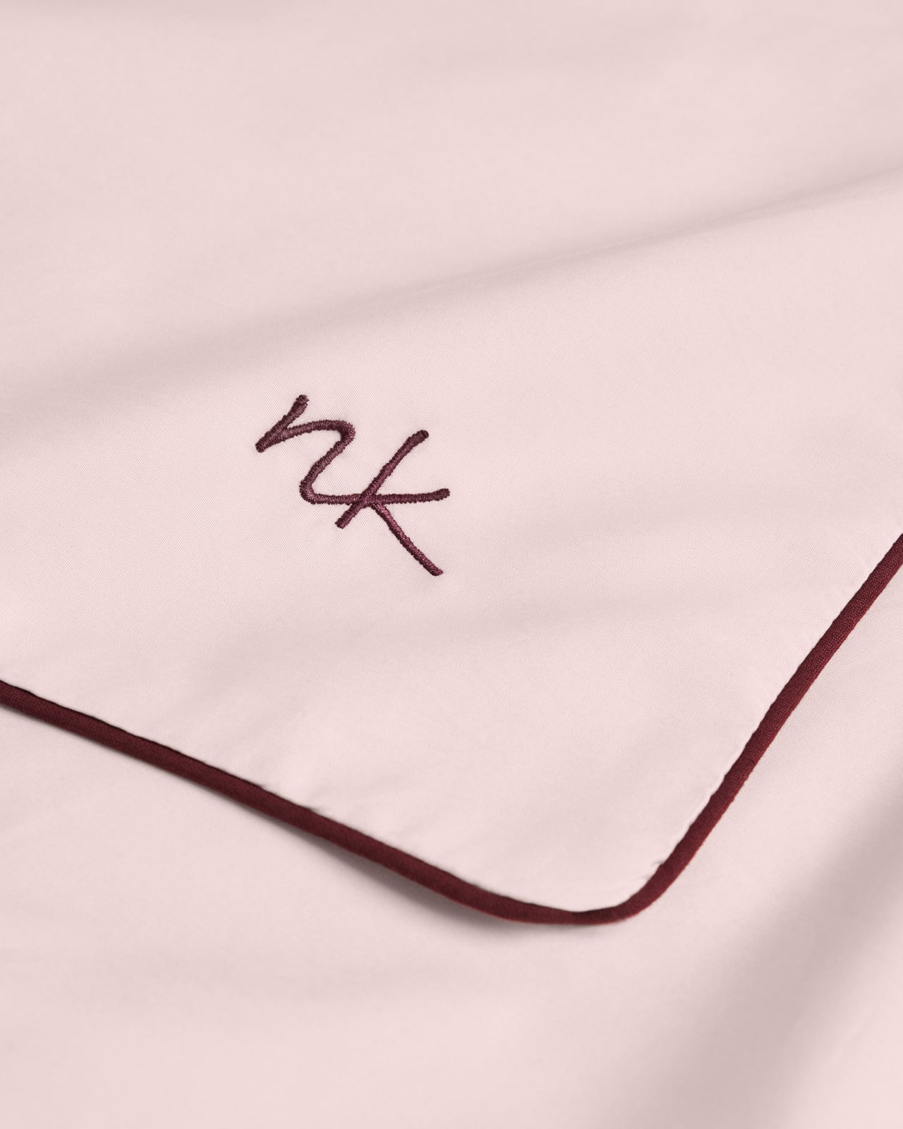
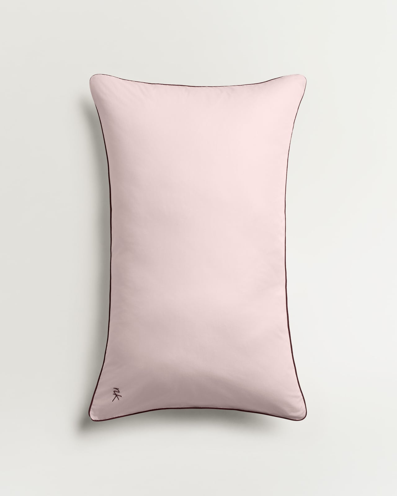
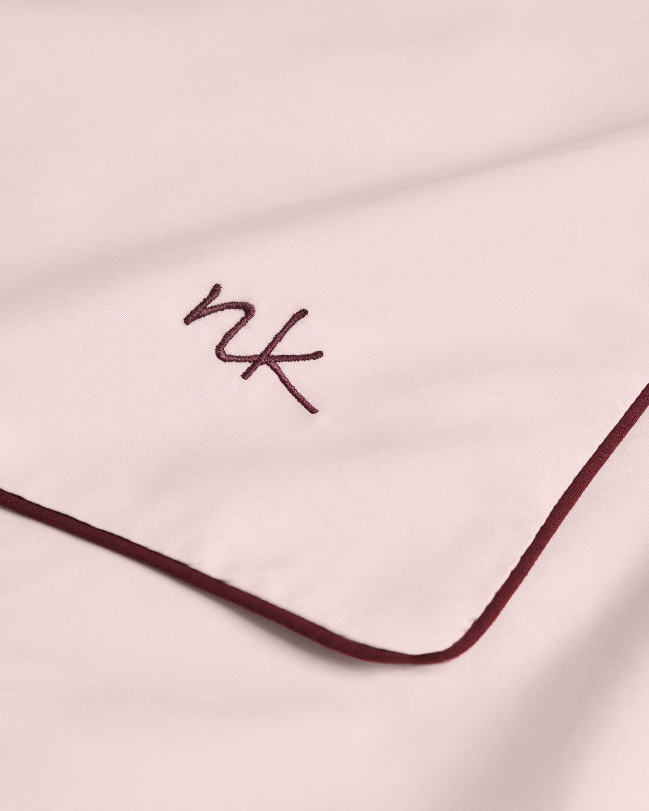
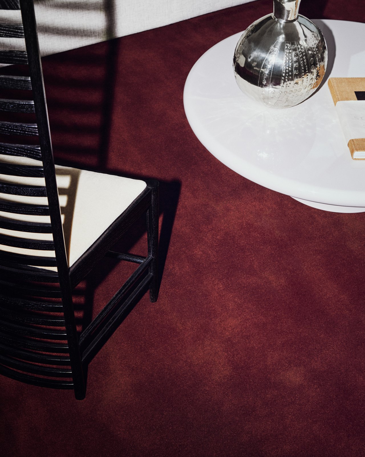
Smooth percale in Soft Pink gives way to burgundy accessories in fresh linen, building colour through different shades of the same family. Rather than contrast, the interest comes from depth and texture: pale against saturated, soft against rich, one red leading quietly into the next.
Tonal, but far from one-note.
New in
Percale Duvet Cover – Pink/Wine
Lightweight Cotton Percale
From £160
New in
Percale Pillow Case (Set of 2) – Pink/Wine
Lightweight Cotton Percale
From £65
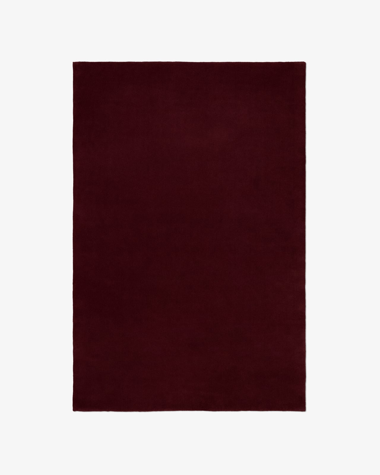
Grand – Deep Wine
Plush Luxury Wool Rug
From £845
New in
Studio Linen – Deep Wine
100% Linen Cushion Cover
£85
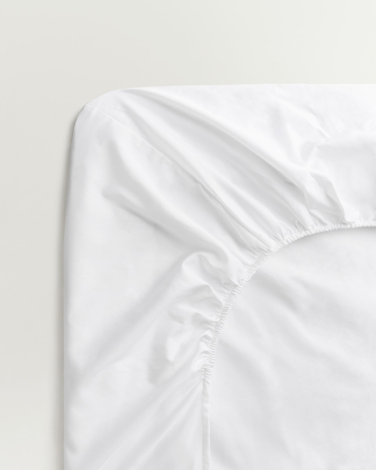
Percale Fitted Sheet – Crisp White
Lightweight Cotton Percale
From £95
New in
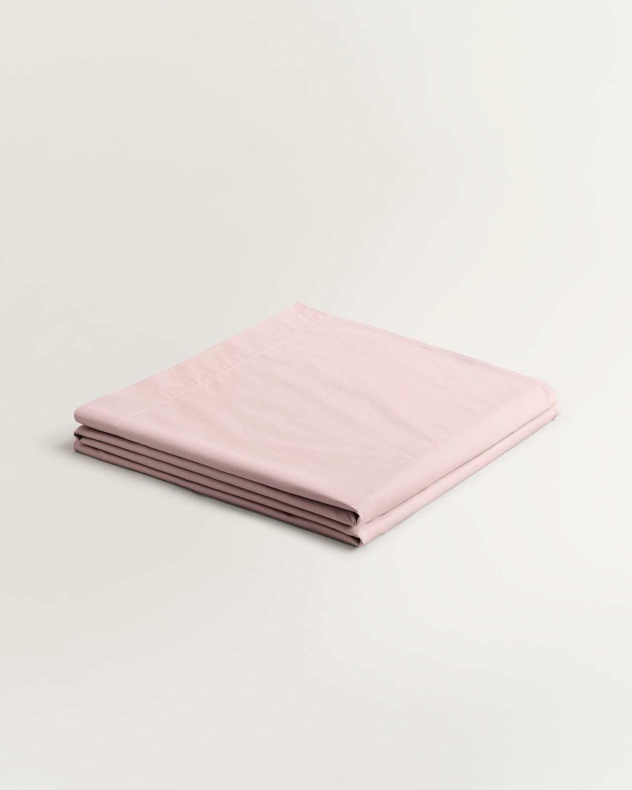
Percale Flat Sheet – Pink/Wine
Lightweight Cotton Percale
From £95
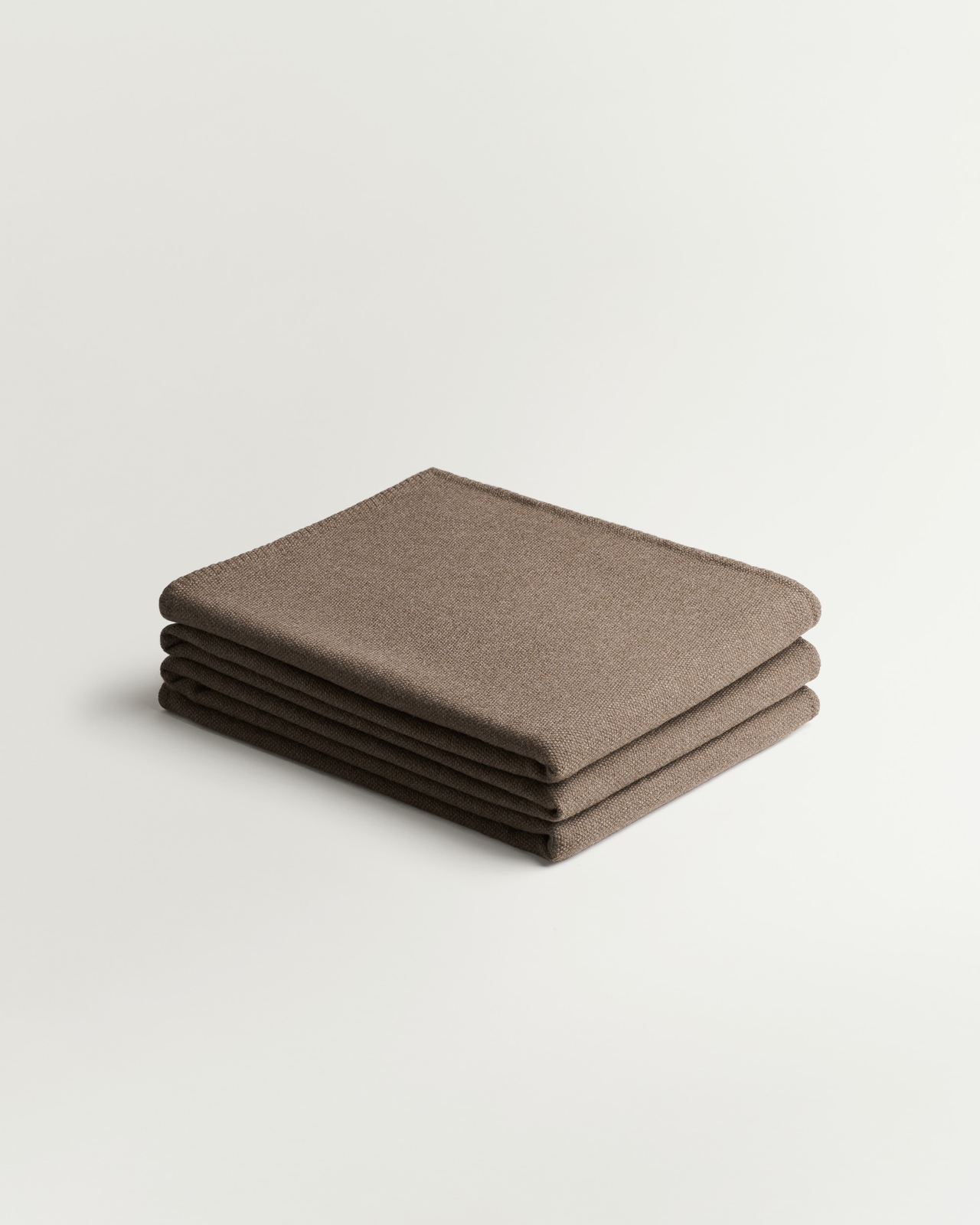
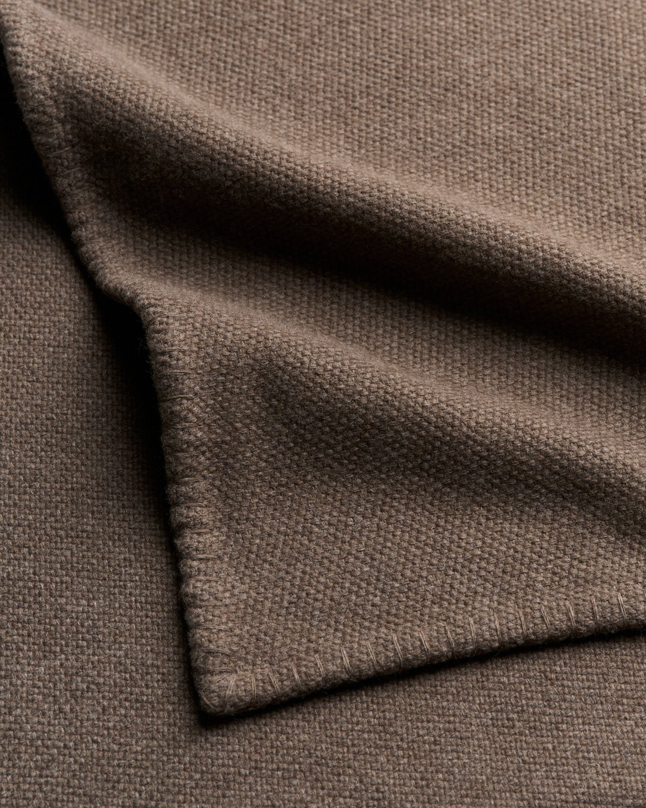
Heritage – Taupe
Cashmere Throw
£515


LOOK 5: BUSINESS BLUES
Sand and Shirt Blue, grounded in cream and Sakura Pink. Silky sateen paired with plush velvet and densely woven wool. A gentle play between warm and cool, light and rich.
Sateen Duvet Cover – Shirt Blue
Luxury Cotton Sateen
From £190
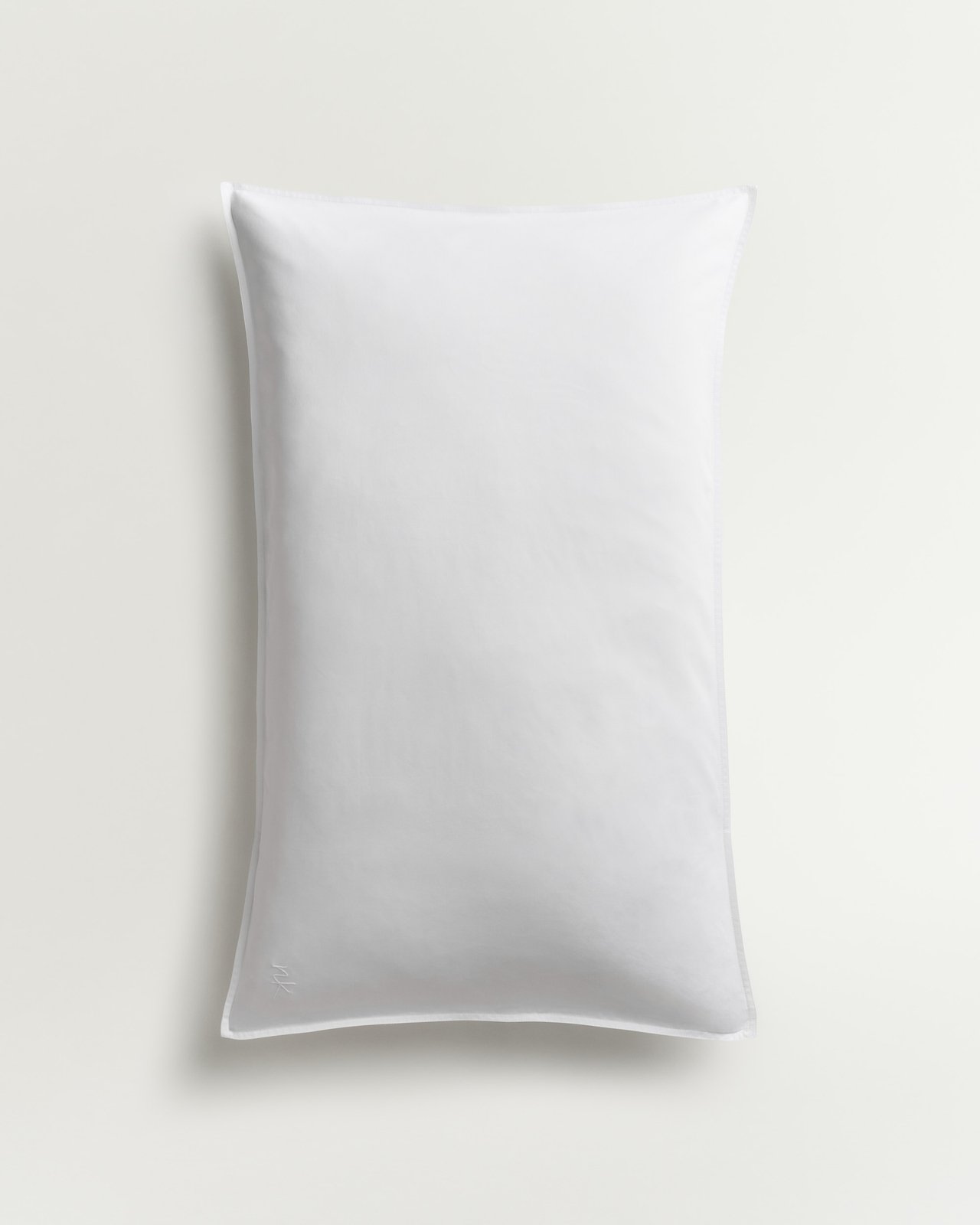
Sateen Pillow Case (Set of 2) – Crisp White
Luxury Cotton Sateen
From £75
New in
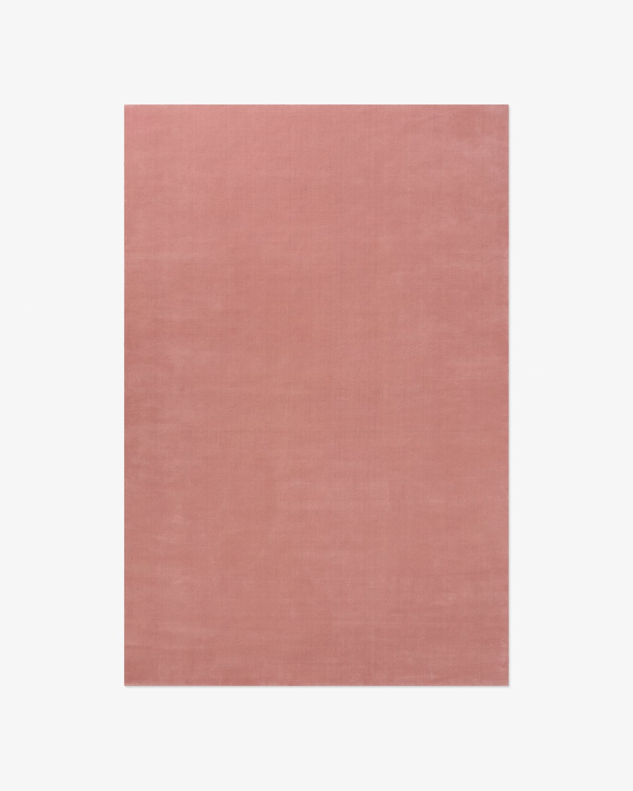
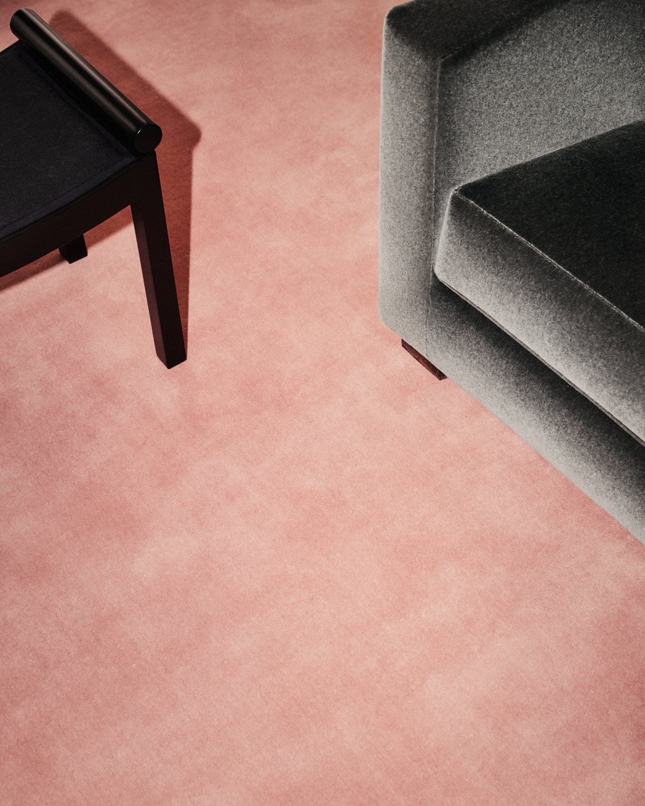
Grand – Sakura Pink
Plush Luxury Wool Rug
From £595
New in
Teddy Velvet – Pecan
Plush Velvet Cushion Cover
£115
Heritage – Cream
Cashmere Throw
£515
Sateen Fitted Sheet – Crisp White
Luxury Cotton Sateen
From £110
Sateen Pillow Case (Set of 2) – Shirt Blue
Luxury Cotton Sateen
From £75