Color Psychology in Rugs: Choosing The Right Shade
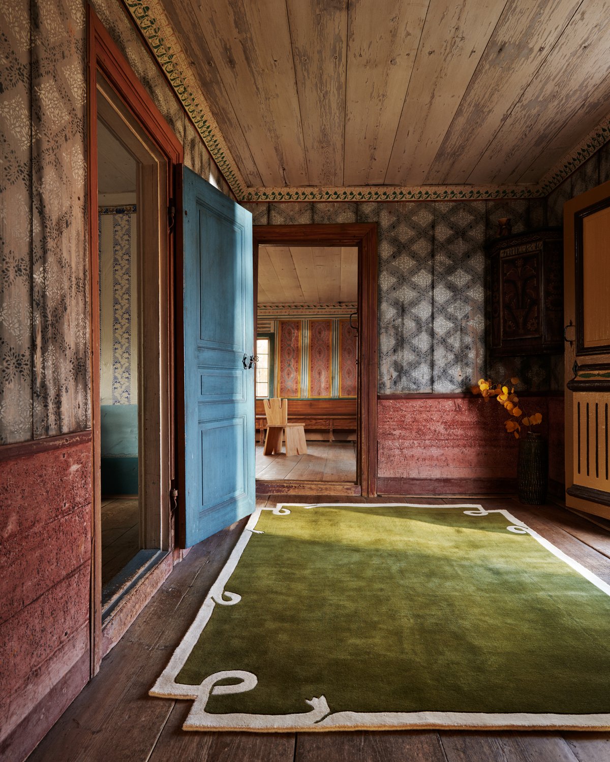
A rug does more than complete a room, it defines it. It’s the anchor beneath your feet, the quiet storyteller of your space. And perhaps the most influential element it offers is color. The hues you choose have the power to shift the atmosphere, affect your mood, and guide how a room is experienced.
At Nordic Knots, we believe color should be intentional, not incidental. Here's how different tones—both classic and unexpected—can shape the feeling of a room, and how to select one that reflects your personal rhythm.
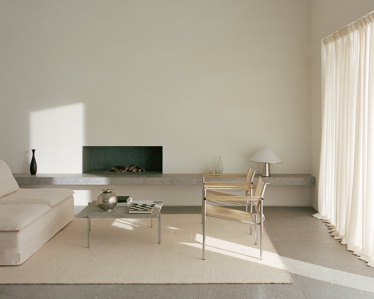
Neutrals: Soft, Serene, Enduring
Colors like Sand, Dusty White, Oatmeal, and Butter bring a quiet ease to any room. These understated hues will open up a room without demanding attention. They reflect light beautifully and lend a sense of calm that feels both intentional and effortless. Neutrals are far from boring; they’re the foundation for thoughtful layering. Perfect in bedrooms, living spaces, or anywhere you want a sense of stillness, they pair naturally with wood, textured textiles, and clean lines as well as bold details the home might carry.
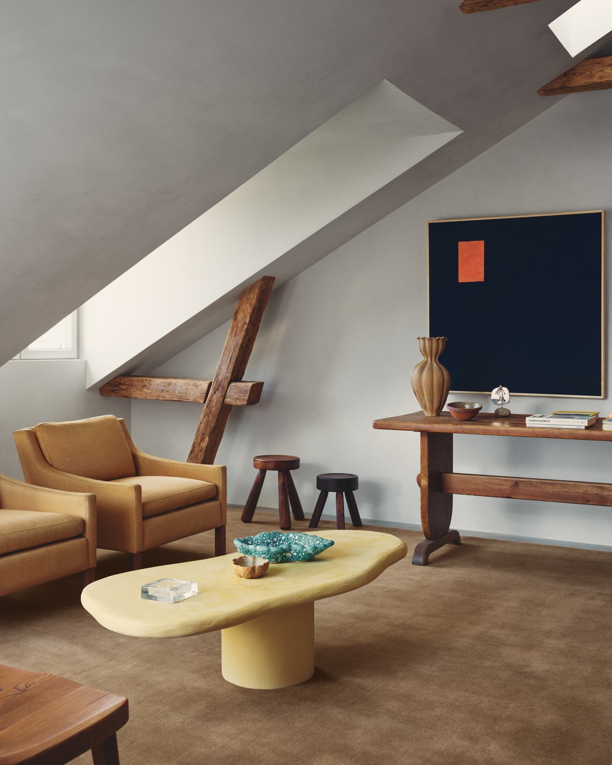
Earth Tones: Warm, Grounded, Inviting
Leo, Chestnut, Warm Gray and natural jute evoke a deeper sense of character to a room. These shades carry warmth and presence—they make a space feel settled, welcoming, and full of life. Ideal for gathering spaces like living rooms, dining areas, and kitchens, they invite connection and comfort. Their natural versatility allows them to sit comfortably alongside both cooler and warmer tones and they bring depth and softness to a space without feeling overly styled.
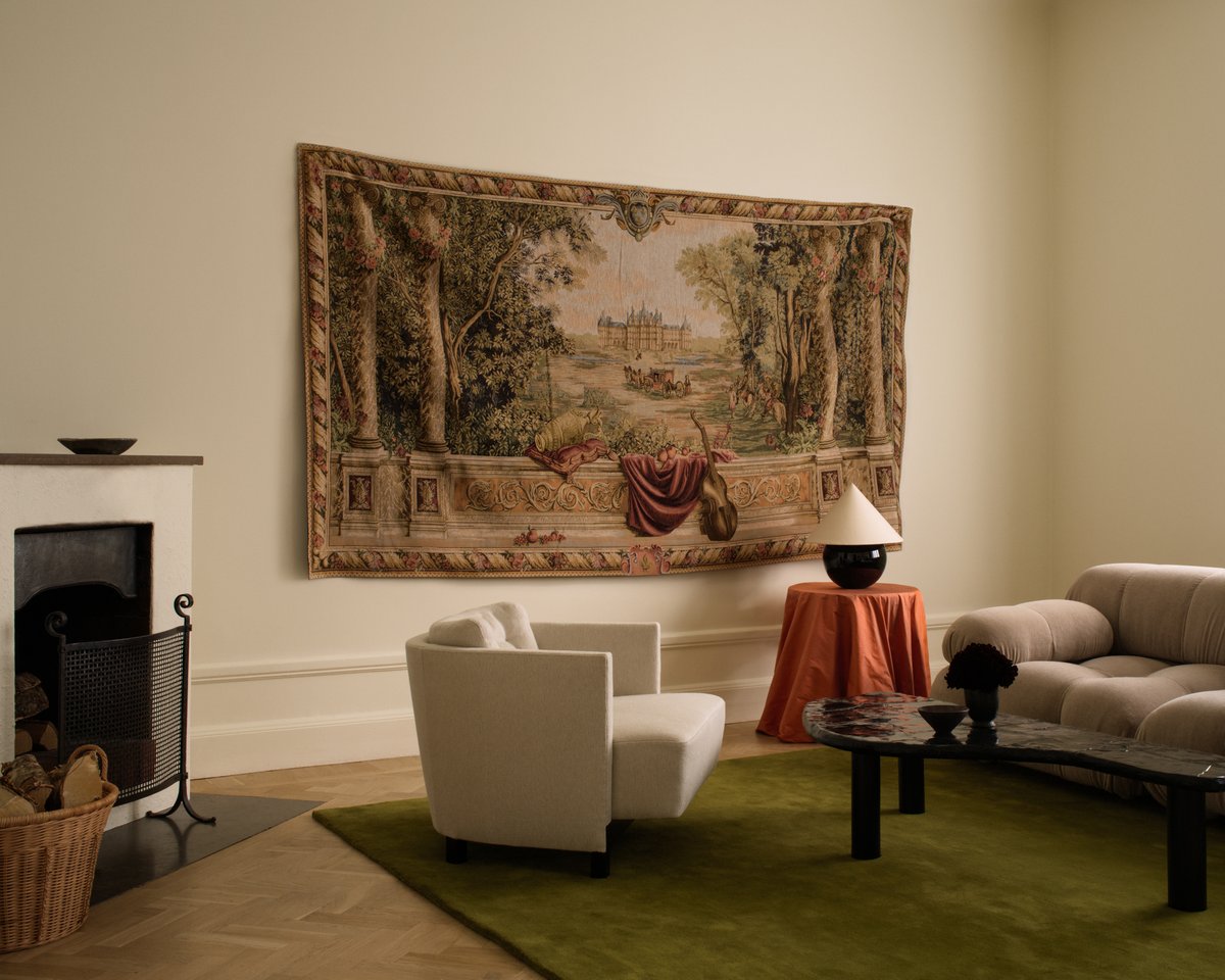
Greens: Restorative, Balanced, Organic
Green plays a defining role in our palette—reflecting a deep connection to nature and the calm, balanced feeling it brings into the home. It’s a color that supports a space without needing to dominate it, yet it can easily be a statement if you go with a bolder hue.
Soft tones like Pale Green and moss offer a subtle, calming presence, versatile enough for almost any room. For more depth, Milano Green and Pine adds richness and a more vibrant feeling. Green is more than a backdrop. It’s a tone that shapes how a room feels—settled, intentional, and in tune with its surroundings.
Reds: Passionate, Bold, Refined
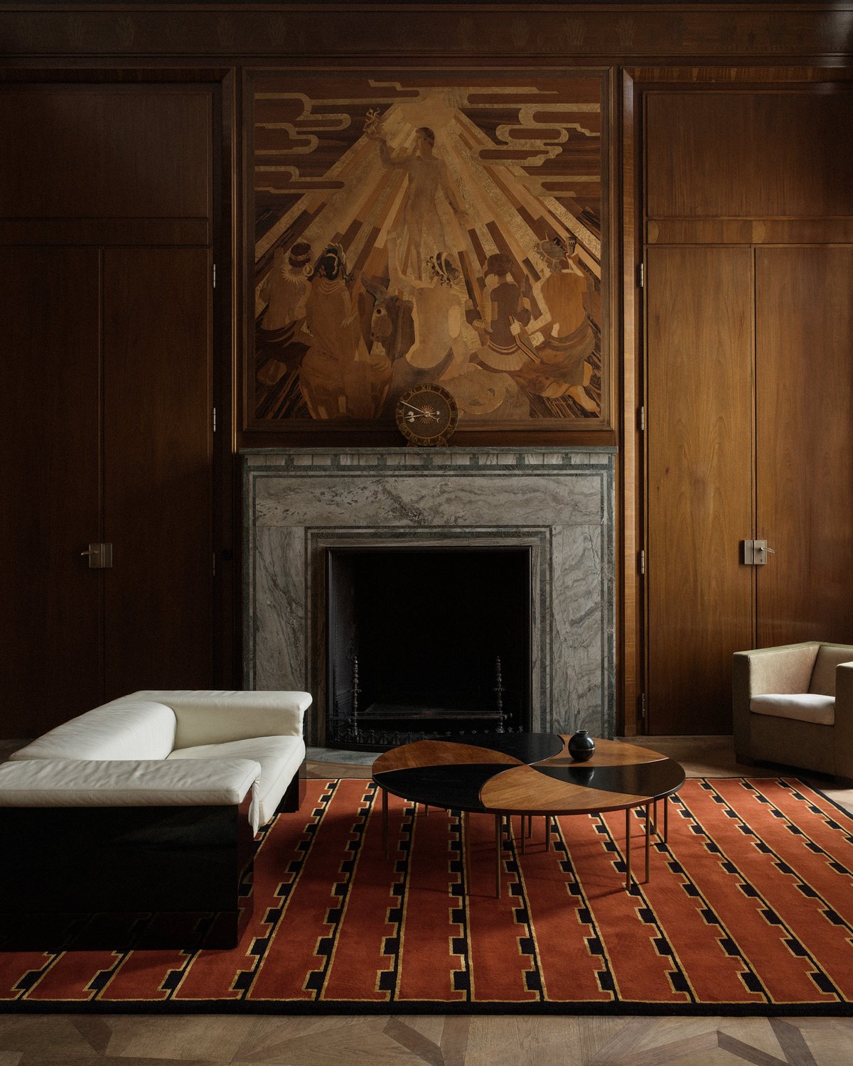
Red is expressive and rich with emotion. Choose deeper tones such as Burgundy and Deep Wine for sophistication, these can elevate formal living areas or make a powerful statement in otherwise pared-back spaces. Terracotta and Brick Red are more earthy and muted, lending warmth without overwhelming. Either way, red brings energy, but when used with restraint, it also offers depth and drama that lasts.
Blues: Tranquil, Composed, Sophisticated
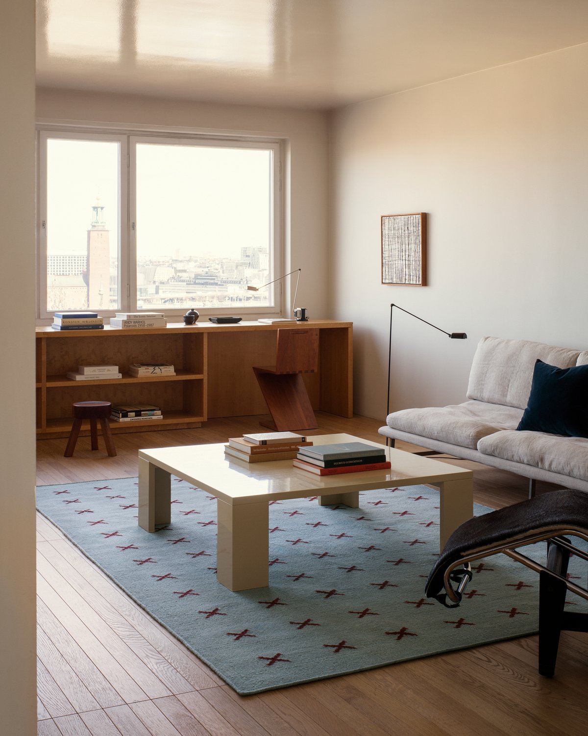
Blue evokes stillness and introspection without being boring. Lighter tones as Powder and Sky blue feels fresh and breezy, perfect for smaller rooms where you want to introduce lightness. Deep and Navy Blue bring a sense of depth and quietude with a timeless elegance. Blue is a natural choice for bedrooms, studies, and reading corners—spaces where you want to encourage stillness and ease.
Dark Tones: Dramatic, Grounding, Modern
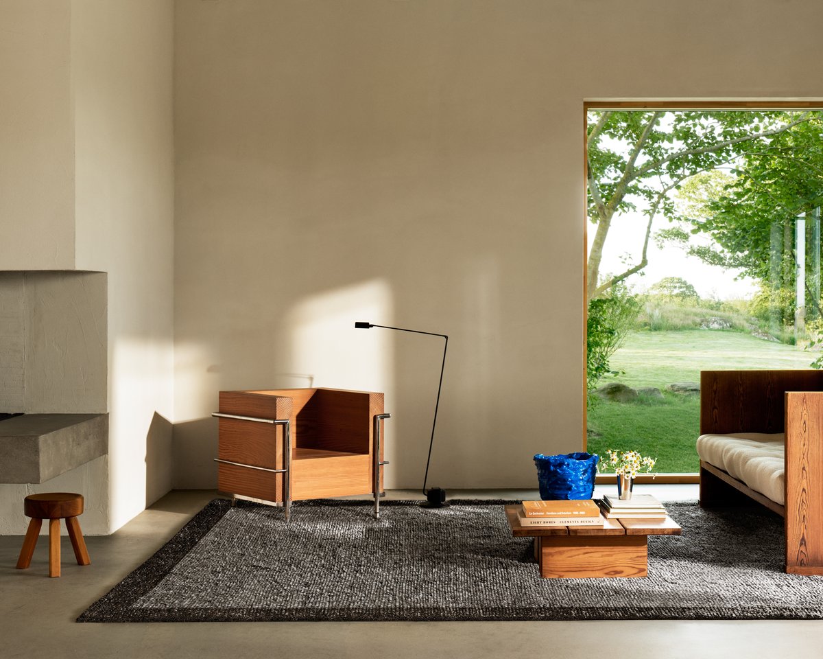
Walnut, Pencil Gray, and Anthracite bring weight and intention to a space. These dark tones introduce contrast and clarity, grounding a room and giving it shape. In open-plan layouts or minimalist interiors, a dark rug doesn’t just anchor the furniture, it adds depth and quiet drama. A dark foundation allows everything else—texture, light, color—to stand out with more purpose.
Multi-Tonal & Patterned: Expressive, Eclectic, Curated
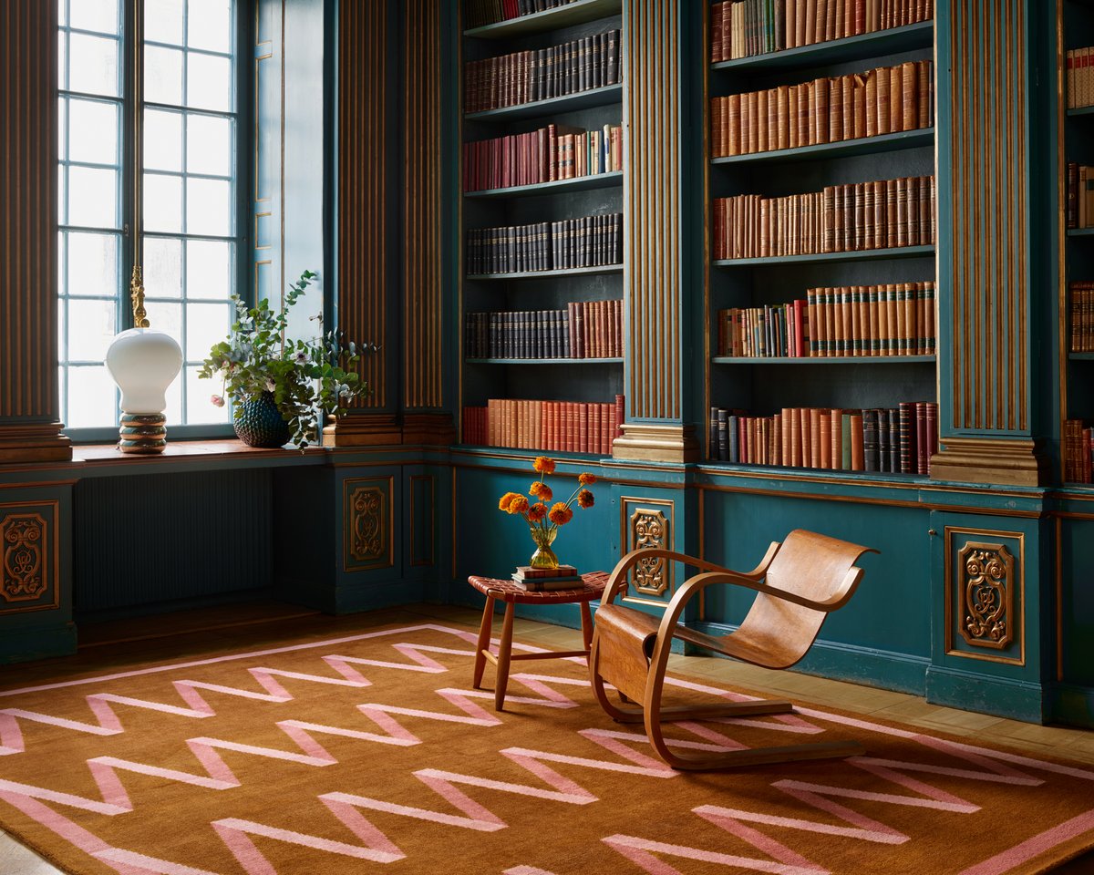
Patterned and multi-tonal rugs bring energy and nuance to a room. They do more than add color, they introduce variation, texture, and depth. Whether it’s soft gradients, tonal layering, or graphic motifs, these designs quietly guide the eye and shape the flow of a space.
In neutral interiors, a patterned rug can become the element that brings everything to life—adding interest without noise. In more expressive rooms, it works as a unifier, pulling together varied tones, finishes, and shapes with ease. It’s the kind of piece that doesn’t fight for attention, but holds it and anchors the space with a sense of balance and design intention. A rug isn’t just a detail. It’s the starting point. The layer that sets the tone for everything else.