The Colors, Textiles & Materials of Summer 2025

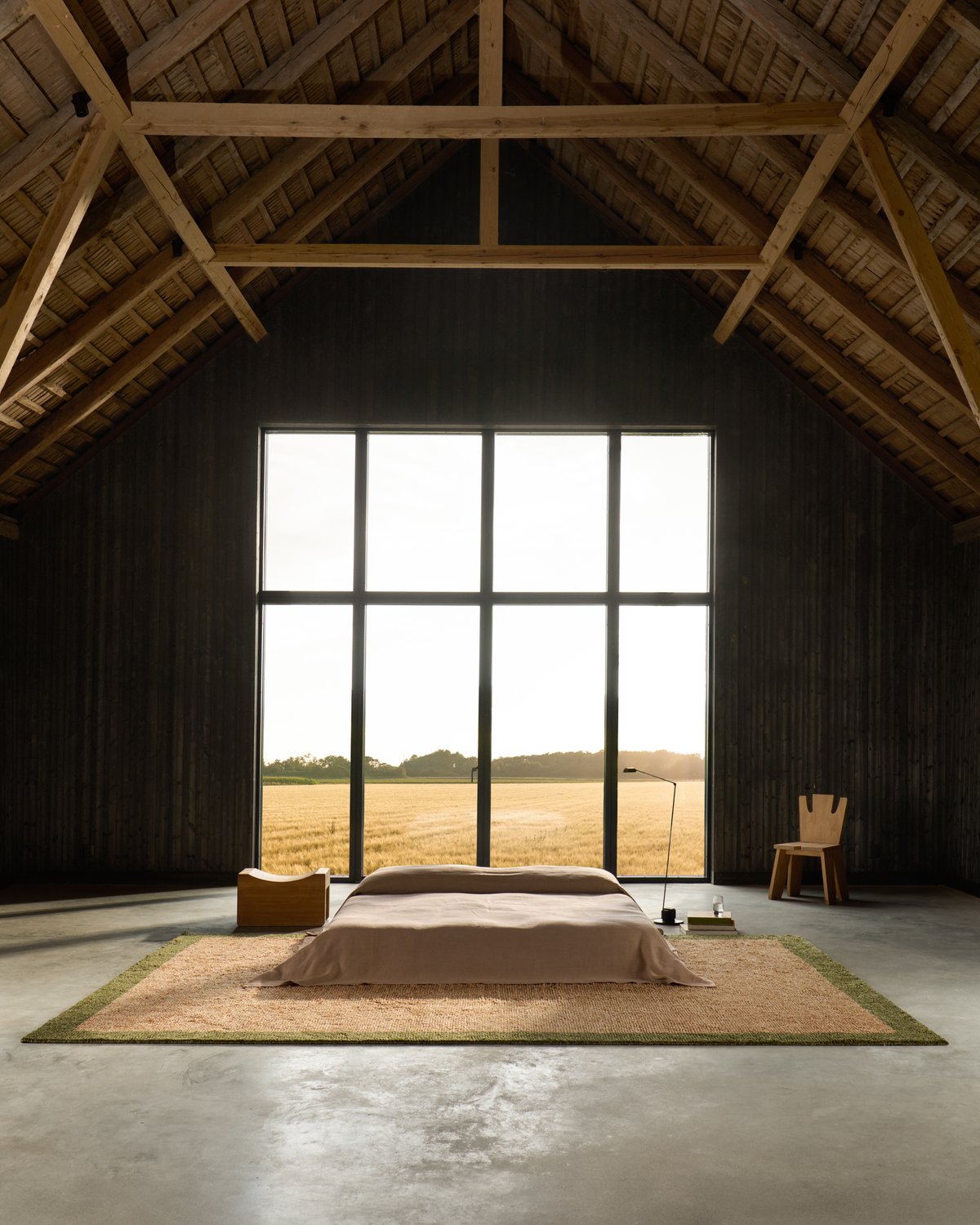
In 2025, summer interiors aren’t trying too hard, they’re just quietly getting it right. Interiors are leaning into softness, into natural materials that breathe, and into a slower, more effortless rhythm. Rather than chasing dramatic changes, this season is about subtle shifts: adjusting the light, softening the palette, and letting texture do the talking. It’s a gentle evolution that feels distinctly Scandinavian—uncomplicated, natural, and deeply rooted in how we want to feel, not just how we want things to look.
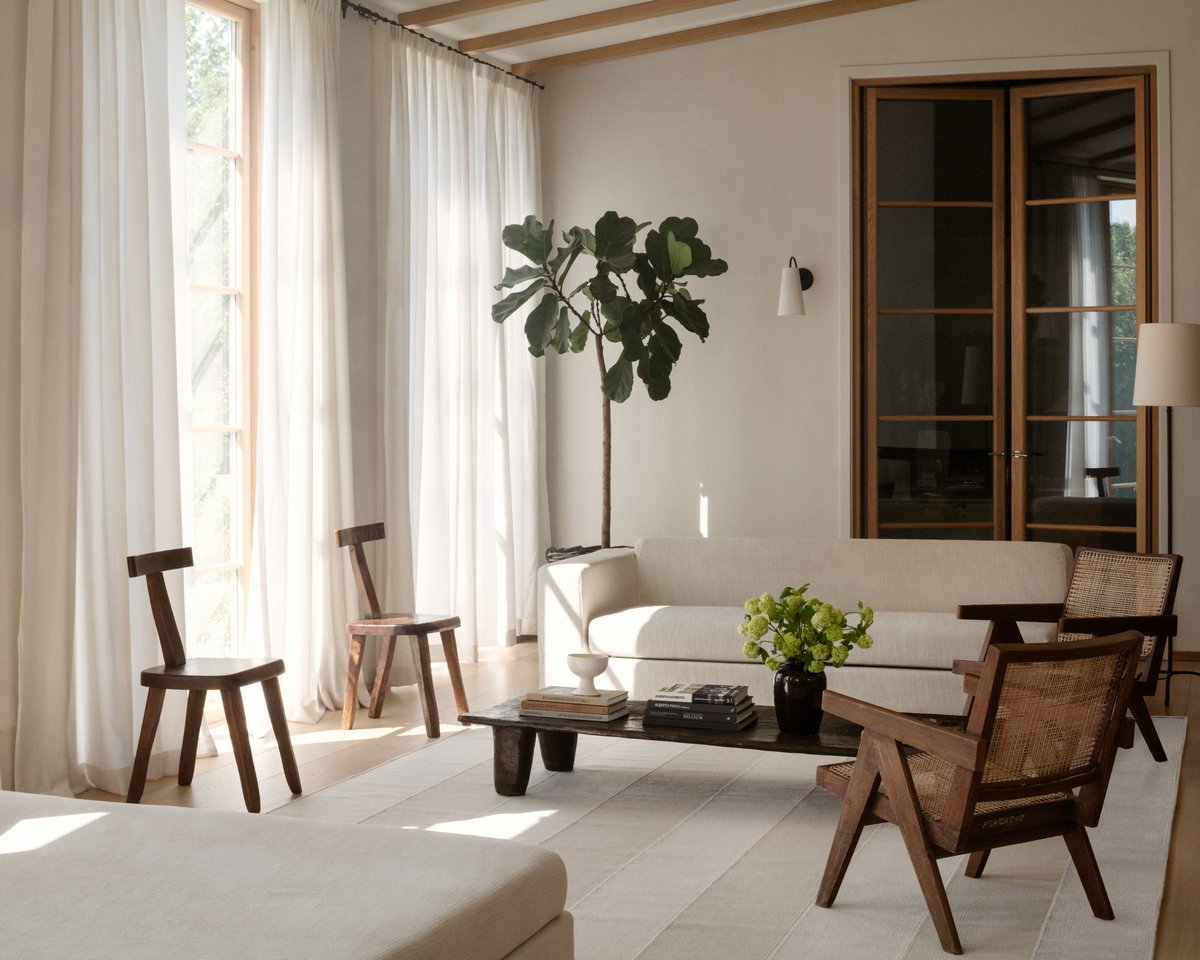
This summer’s color palette feels sun-warmed and softly faded, like the tones you’d find in nature. Soft brown, creamy butter, muted blue, and sandy beige are layered with chalky white and washed-out green—colors that don’t shout, but settle gently into a space. These hues bring a quiet richness to interiors, offering warmth without heaviness, and subtle contrast to the clean, pared-back tones at the heart of Scandinavian design. These hues bring a relaxed, sun-warmed quality into the home, perfect for creating spaces that feel open yet comforting, minimal yet never cold.

Textiles are responding in kind. We’re seeing layers of linen, cotton, and wool in their purest forms—washed, crinkled, imperfect in texture but elevated in tone. Curtains are sheer but substantial, filtering light with softness rather than blocking it entirely. Throws and cushions lean into the handmade, with open weaves, delicate fringe, and a tactile presence that invites touch.
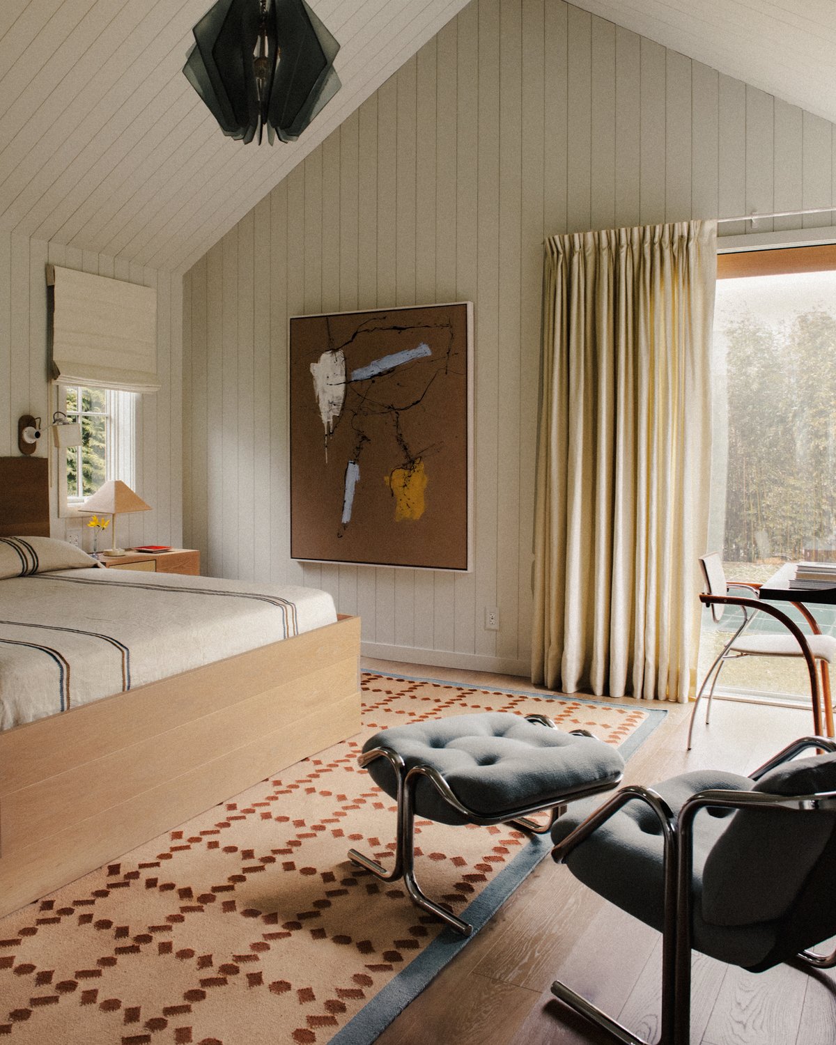
Pattern is making a quiet return. Not in loud graphics or bold colors, but in subtle, sun-faded motifs that feel nostalgic and modern all at once. Slim pinstripes, tone-on-tone checks, small-scale florals, and painterly washes are finding their way into rugs, cushions, and drapery. These gentle prints add a sense of rhythm to a room, especially when layered with solids in complementary shades.

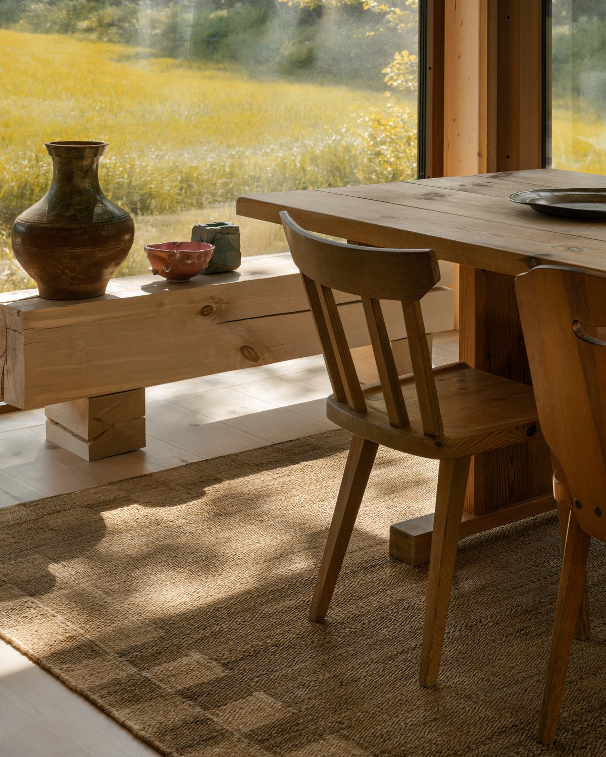
The meaningful focus on the love for craftsmanship is more current than ever. There’s a growing desire for pieces that show the hand of the maker—hand-knotted rugs, stitched details, woven textures that don’t feel mass-produced. These elements bring depth into the space. They remind us that beauty doesn’t have to be loud to be powerful, and they last for generations.
Finally, it’s not about reinventing your space, but refining it. Letting your home breathe. Choosing fewer, better pieces that invite you to slow down. It’s about lightness—not just in color or fabric, but in feeling. And in the end, it’s this quiet, comfortable kind of beauty that lingers the longest.
